


How to Design a Highly Effective Homepage on Squarespace
Designing a highly effective homepage on Squarespace is easier than you think!
The homepage is the digital welcome mat — it’s the first thing visitors see when they arrive on a website. That’s why nailing the homepage design is so critical.
In this guide, you’ll discover proven strategies to create homepages that convert visitors into customers. I’ll cover how to optimize for your client’s business goals, drive traffic to key pages, and showcase their unique brand story.
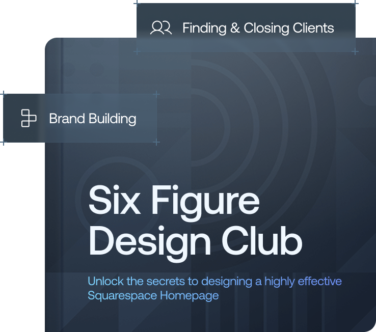
Finally, I will show you how my Six-Figure Design Club course can help you scale your web design business. With the right strategy, you can help any Squarespace site succeed, which will lend credibility to your brand and grow your revenue.
Let’s dive in and start building homepages that wow!
Understanding Your Client’s Goals and Needs
As a Squarespace designer, you have the power to craft an incredible first impression for your client’s websites. However, you can’t do this effectively if you don’t understand your client’s goals and needs. Hence, your top priority in designing a highly effective home page is “knowing your client,” which you can achieve by doing the following:
Define the client’s vision.
Do your research.
Develop a plan.
Define specific objectives.
1. Define the client’s vision.
The first step is understanding your client’s vision and goals for their Squarespace website. Be sure to schedule a consultation to discuss what they want to achieve and who their target audience is. Ask questions to determine what’s most important to them, like increasing sales, building their brand, or providing information. Write down their key goals and refer back to them often during the design process.
2. Do your research.
Learn as much as you can about your client’s business and industry. Analyze their competitors’ websites to see what’s working well and what can be improved. Look for opportunities to differentiate your client from the competition. The more you understand your client’s business, competitors’ strengths, and customers, the better equipped you’ll be to create a homepage that achieves their goals.
3. Develop a plan.
Now that you understand the client’s needs and vision and have done your research, work with the client to develop a plan for the homepage. Determine what key elements need to be included, like a hero image to make a visual impact, client testimonials to build trust, or a clear call-to-action (CTA) to capture leads or drive sales. Create wireframes or sketches to make sure you’re both on the same page before building the homepage.
4. Define specific objectives.
The homepage needs to have clear objectives, like increasing traffic, capturing leads, or driving sales of a new product. Discuss quantifiable metrics with your client so you can optimize the homepage to achieve these objectives. You might aim for a certain number of lead captures per month or target a specific conversion rate. Defining objectives upfront helps ensure the homepage is as effective as possible, helping the client achieve their goals.
With a clear vision and understanding, you are now in a better position to choose a suitable template for your design.
Choosing the Right Squarespace Template
The template you choose is the foundation for your client’s website and shapes the overall look and feel. However, note that when building a home page for a new Squarespace site running on version 7.1, there is a streamlined design process, offering more flexibility rather than fixed templates. For websites running on the Legacy 7.0 version, selecting the right template is key to shaping your client's website's look and feel.
Business Templates
For most small businesses, a clean, versatile template like Five, Wells, or Avenue works well on version 7.0. They provide ample room for bold visuals, text, and calls to action. If your client wants a standalone landing page, consider a more minimalist option like Horizon.
Portfolio Templates
Visual artists on 7.0 should consider templates focused on imagery like Naomi, Quinn, or Bergen. These make photos and videos the star of the show with full-width slideshows and galleries. For a resume or CV site, the simple yet stylish Brine or Rally templates are excellent choices.
Blog Templates
Editorial-focused templates like Bedford or Native are optimized for blogging on 7.0. These templates feature post preview cards, related content sections, and space for ads or sponsors. For a personal blog, minimally designed templates like Foundry and Haute provide a simple yet stylish platform to share thoughts and stories.
Regardless of the Squarespace version you’re working with, it's essential to choose a design that embodies your client’s brand and vision. I recommend using Squarespace’s free trial to test how your content works within these frameworks. This hands-on approach is invaluable in finding the perfect starting point for a site that impresses and engages. Remember, with Squarespace 7.1's adaptable design approach, the focus shifts to individual page elements and site features, providing a seamless experience regardless of the template.
Optimizing for Conversions With Clear Calls-to-Action
The essence of our preparations so far is to make a good first impression. Our goal with this approach is to ensure visitors take action. However, taking action is largely influenced by how much you present your client’s offerings. This is where strategic calls-to-action (CTAs) come in — studies show that personalized CTAs convert 42% more visitors!
Follow these tips to prepare a compelling CTA for your client’s homepage:
Use action-oriented language.
Choose attention-grabbing colors.
Place CTAs strategically.
Match CTAs to audience goals.
1. Use action-oriented language.
For CTAs to be effective, use concise yet compelling language that prompts the user to take action. Phrases like “Get Started Now,” “Learn More,” or “Sign Up Today” are excellent options. Avoid passive language like “Click here,” which doesn’t convey a strong message.
2. Choose attention-grabbing colors.
The color of your CTA buttons or links significantly impacts conversion rates. Blue and green are frequently used because they inspire trust and growth. Red is also an option if you want to convey urgency or excitement. Whichever color you pick, make sure it stands out from the rest of the page so visitors notice it.
3. Place CTAs strategically.
The location and prominence of your CTAs also matter. Place them above the fold near the top of the page so visitors see them right away. You can also repeat the CTAs further down the page. For the best results, limit CTAs to 2–3 per homepage so you don’t overwhelm the user.
4. Match CTAs to audience goals.
The language and design of the CTAs should align with the target audience and their motivations for visiting the site. For example, if your client is an e-commerce store, their homepage CTAs should focus on prompting visitors to shop or browse products. For a service-based business, the CTAs may emphasize scheduling a consultation or signing up for a free trial.
When done well, clear calls-to-action can significantly impact your client’s bottom line by driving more conversions and sales. However, this is just a part of the puzzle — a page header is just as important as its CTA.
Crafting Compelling Header Content
A homepage header content is crucial for capturing visitors’ attention and conveying the essence of your client’s business.
Ask yourself, “What do I want visitors to know within the first 3 seconds of arriving on this page?” That’s the message your header content should convey.
To ensure a page header content that drives action among users, follow these tips:
Use an attention-grabbing headline.
Write a compelling subheadline.
1. Use an attention-grabbing headline.
Your headline is the first thing visitors will see, so make it count. A good rule of thumb is to use numbers and questions or invoke curiosity to pique interest. For example, “3 Ways We Can Improve Your Customer Experience” or “Tired of Poor Service?” Consider using power words like “you,” “free,” “secrets,” or “guaranteed.” Keep your headline between 60 and 100 characters for maximum impact.
2. Write a compelling subheadline.
Your subheadline expands on the headline and gives visitors more context about what your client offers. Aim for a subheadline of 3 short sentences or around 50 to 70 characters total. For example, a suitable subheadline for a customer service provider, “CS by Markus,” can be “…so you can focus on what really matters — your products.” Overall, keep your tone confident yet approachable.
Following these best practices for crafting compelling header content will make a killer first impression and motivate visitors to engage further with your client’s Squarespace site. Another aspect you need to get right is the use of imagery — people are 94% more likely to view content that has relevant images.
Want a framework for designing the perfect homepage?
Curating Eye-Catching Imagery
Creating an attractive homepage design means choosing visuals that capture attention and set the right tone. Imageries are powerful design elements that help communicate unwritten ideas — as the popular maxim goes, a picture is worth a thousand words!
As a Squarespace designer, you have access to a range of stock photos and graphics, as well as the ability to upload custom images. Use them to drive conversions for your client’s homepage!
1. Photos
Photos are highly engaging and help bring a homepage to life. For most businesses, lifestyle photos, product photos, or images of people using their product or service help build familiarity with visitors. Think about photos that evoke emotion and show the benefits of what the business offers. For example, a lifestyle photo of a happy family for a pediatric clinic or photos of satisfied customers using a tech product.
2. Infographics
Infographics are an interactive way to visually represent information, statistics, and data. They draw the eye in and keep visitors engaged, increasing web traffic by 12% and boosting shares by a staggering 200%. If your client has interesting industry data or statistics to share, an infographic is a compelling way to do that on the homepage. Make sure the infographic is easy to read, with clear headings, and follows a logical flow or story.
3. Text Overlays
Adding text overlays on top of images is a simple way to create high-impact visuals. The text helps to give context to the image and draws attention. Examples are an image of a team collaborating with an overlay like “We Help Teams Work Better Together” or an image of a product with an overlay highlighting its key benefits. Be sure to choose a font that is easy to read and a color that contrasts well with the image for maximum impact.
The imagery you choose for a Squarespace homepage is highly dependent on the client and their brand. Focus on using emotive, high-quality, and impactful photos to ensure you come up with a stunning and engaging design. However, all of these design elements won’t drive ample conversions if visitors have a hard time navigating the webpage.
Streamlining Site Navigation
User experience (UX) is a key web design component that every good website designer must prioritize. It dictates how a visitor interacts with your client’s website and takes action. A well-designed user interface has been found to boost conversion rates by up to 200%, while a redesigned UX design can raise this figure to 400%.
Navigation is a key user experience element, and the home page, being the website’s most important page, must boast smooth navigation.
Consider the following tips to ensure a homepage design that promotes easy navigation:
Structure your navigation clearly and intuitively.
Offer multiple navigation options.
Maintain a consistent navigation scheme.
Remove obstacles and streamline the user journey.
1. Structure your navigation clearly and intuitively.
Organizing navigation in a simple, logical manner is key to ensuring users enjoy a smooth ride while accessing your client’s homepage. Group similar pages together under main navigation links like “About Us,” “Services,” “Contact,” etc. Only include links to your most important pages in the main nav; secondary pages can be accessed through submenus.
2. Offer multiple navigation options.
Don’t rely on just a horizontal top nav; also include a “hamburger” menu for mobile, site-wide search, and footer links. The more choices you give visitors, the more likely they are to find what they’re looking for. Anticipate the paths users may want to take and provide links to facilitate them. For example, on an e-commerce site, include links to “Shop All Products,” “Sale Items,” “New Arrivals,” etc., directly on the homepage.
3. Maintain a consistent navigation scheme.
Once you establish your client’s homepage’s navigation structure and organization, stick to it across all pages. Apart from the fact that consistency builds familiarity and trust in your client’s brand, visitors will get frustrated if links shift around or change names from page to page. For the best user experience, navigation should remain static and consistent; only make changes if necessary, and be sure to test with users first.
4. Remove obstacles and streamline the user journey.
Evaluate your client’s homepage’s current navigation and look for any pain points that could frustrate visitors or cause them to abandon the site.
Here are key questions to ask yourself:
Are there too many clicks required to access certain pages?
Do menu options or link labels need clarification?
Are there redundant or unnecessary links?
Trim the fat and optimize your client’s homepage’s navigation to make it as simple as possible for users to browse and access content.
But building a stellar homepage doesn’t end at ensuring seamless navigation. There are extra features you can explore for your client’s success, as I’ll explain below!
Integrating Social Media and Email Capture
Having an email signup form on your client’s Squarespace homepage is crucial for building their email list and staying in touch with visitors. However, many people are hesitant to sign up for yet another newsletter subscription these days. One way to overcome this objection is by integrating social media icons and buttons into a homepage’s email capture design.
When visitors land on the homepage, they’ll see familiar social media logos from platforms like Facebook, Twitter, Pinterest, and Instagram. By clicking these icons, they can easily share the page content with their networks and follow your client business on their favorite social platforms. This helps to build trust and authority for the brand, which encourages buying decisions.
Social Share Buttons
Add social share buttons next to posts, images, and other content on the homepage so visitors can spread the word with one click. For example, place share buttons at the top of the homepage’s featured blog post so readers can instantly share that content on social media. These buttons make sharing so simple that visitors will be more inclined to spread the website’s content, which increases traffic and backlinks.
Link to Social Profiles
Include social media icons that link directly to your client’s business profiles on Facebook, Twitter, Instagram, and other platforms. This gives visitors an easy way to connect with the business on their network of choice. Once they start following the account on social media, they’ll be more open to signing up for an email list to stay in touch.
Seamless Experience
Using the same profile photo, color scheme, and voice across your client’s homepage, email marketing, and social media profiles creates a cohesive experience for visitors. When a brand’s messaging feels familiar and consistent, visitors will be more comfortable engaging with the brand across channels. They’ll recognize the business’ email signup form as an extension of the helpful content and community they’ve found on their favorite brand’s social platforms and website.
So far, I’ve walked you through different design elements to incorporate into your homepage design strategy to help your client hit their goals — increased conversion and revenue! But just before you hand over the final design to your client, there’s one last thing to do — continuous testing and improvement.
Testing and Refining the Design
Once you have a homepage design you’re happy with, it’s time to put it through some rigorous testing. Continuous testing is essential for identifying design areas that need improvement. User testing, in particular, is a key strategy for refining product design effectively.
A robust testing strategy ensures the homepage’s stability, responsiveness, and reliability, and here’s how to conduct one:
Do a personal test.
Conduct user testing.
Repeat the process.
1. Do a personal test.
Start by testing the design yourself. Go through each page element, checking for any layout issues, broken links or images, confusing navigation or wording, etc. Get friends or colleagues to review and provide feedback. They’ll spot things you may miss since you’re so close to the project.
2. Conduct user testing.
Next, carry out user testing with a small sample of the client’s target audience. Watch them interact with the site while encouraging them to think aloud. Look for pain points in their experience and see if they intuitively understand how to navigate the site. Their feedback will be invaluable for optimizing the user experience.
You may need to make changes to the information architecture, add explanatory text, or simplify the layout. Don’t be afraid to revise the design, even if it means going back to the drawing board. It’s better to address issues now rather than after the launch.
3. Repeat the process.
Once you’ve made the necessary refinements, do another round of testing to ensure all problems have been resolved. When your test users can easily achieve their goals and have a positive experience on the site overall, you’ll know the design is ready to go live.
However, testing shouldn’t stop there; continue to get feedback from actual site visitors and make incremental improvements over time. A homepage is never really “done” — there are always ways to make it more user-friendly and effective. Constant testing and refinement is what separates good designers from great ones. Your clients will appreciate your dedication to creating the best possible experience for their customers.
Do you want to scale your website design career?
Join the Six-figure design club today and learn the exact steps that 140+ Squarespace designers use to generate $1.2 million plus in revenue. Navigate your path to that life of entrepreneurial freedom you’ve always dreamed of!
Parting Words…
You now have all the tools you need to create a homepage that converts visitors into leads and customers. With a clear understanding of your client’s goals and target audience, you can strategically design a homepage that speaks directly to their needs.
Spend time planning the layout, content hierarchy, and visuals to guide visitors to take action. Test different calls to action to determine what resonates best. Monitor analytics to identify opportunities for improvement while staying on top of trends and best practices to keep your designs fresh.
The homepage is your client’s chance to make a stellar first impression. Put the above tips into action and watch your client’s conversion rates soar!
To help you map out the perfect homepage I’ve created an accompanying workbook. Access it now by clicking below.

Need an expert to build your Squarespace website?
Book a free kick-off call with our team to discuss your project requirements in detail.