


Making Images Full Height Within Sections on Squarespace
One of the most common design requests in Squarespace is creating a full bleed image that spans the top and bottom of a section while taking up only half the page.
This is a popular two-column layout style often used for:
homepage hero sections
service pages
portfolio layouts
split-screen call-to-action sections
While this used to require custom code in the Classic Editor, Squarespace’s Fluid Engine now makes it much easier.
That said, many users still get stuck when trying to make the image stretch fully to the edges.
In this guide, I’ll show you exactly how to create a half-page full bleed image in Squarespace, including how to make it extend to the top, bottom, and side edges of the section.
What Is a Full Bleed Image in Squarespace?
A full bleed image is an image that extends all the way to the edge of its container without padding or margins.
In this case, we’re creating a layout where the image:
fills half the section width
spans from top to bottom
bleeds flush to the left or right edge
sits next to text in a two-column design
This creates a clean, modern website layout.

Want a framework for designing the perfect homepage?

Need an expert to build your Squarespace website?
Book a free kick-off call with our team to discuss your project requirements in detail.
Step 1: Open the Section Editor
Start by opening your page in the Squarespace editor and navigating to the section you want to edit.
Click Edit Section.
This is where most people run into the issue of not being able to drag the image all the way to the top.
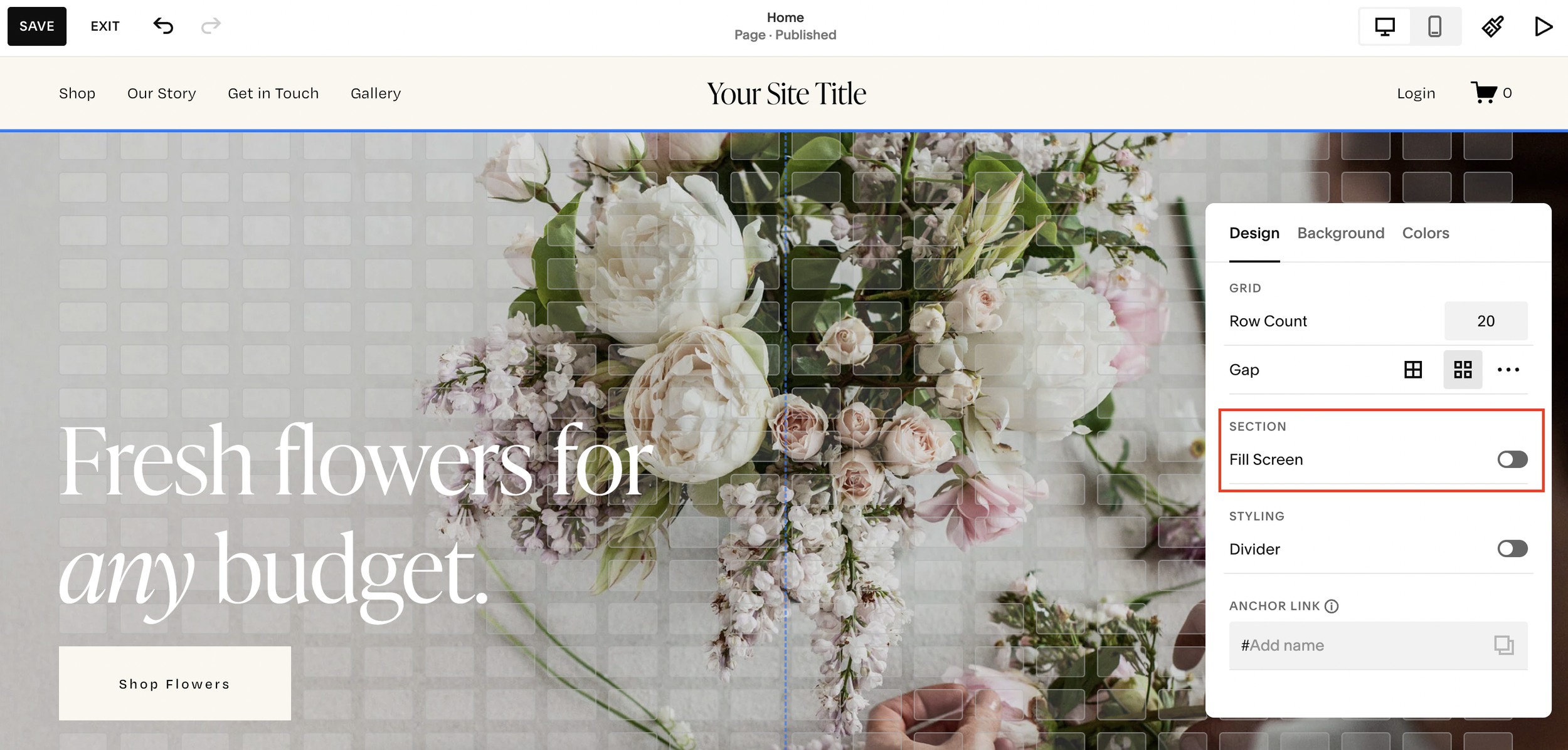
Step 2: Turn Off “Fill Screen”
The key fix is to disable the Fill Screen setting.
Inside the section settings:
locate Fill Screen
toggle it off
As soon as you do this, the image can be moved up to the very top of the section.
This is the most important step.
Without doing this, the image often appears “stuck” and won’t extend fully.
Step 3: Stretch the Image to the Bottom
Once the image reaches the top, drag the bottom edge of the image block downward until it sits flush with the bottom of the section.
Alternatively, you can reduce the section height by dragging the section boundary upward.
The goal is to make the image span the full vertical height of the section.
This creates the top-to-bottom full bleed effect.
Step 4: Align Everything Using the Grid
To keep the layout looking professional, use Squarespace’s grid overlay.
Press G to bring up the grid.
Then check that your image and text columns align correctly.
For example, make sure both sides use the same number of grid rows and columns.
Proper vertical alignment is especially important in split-screen layouts.
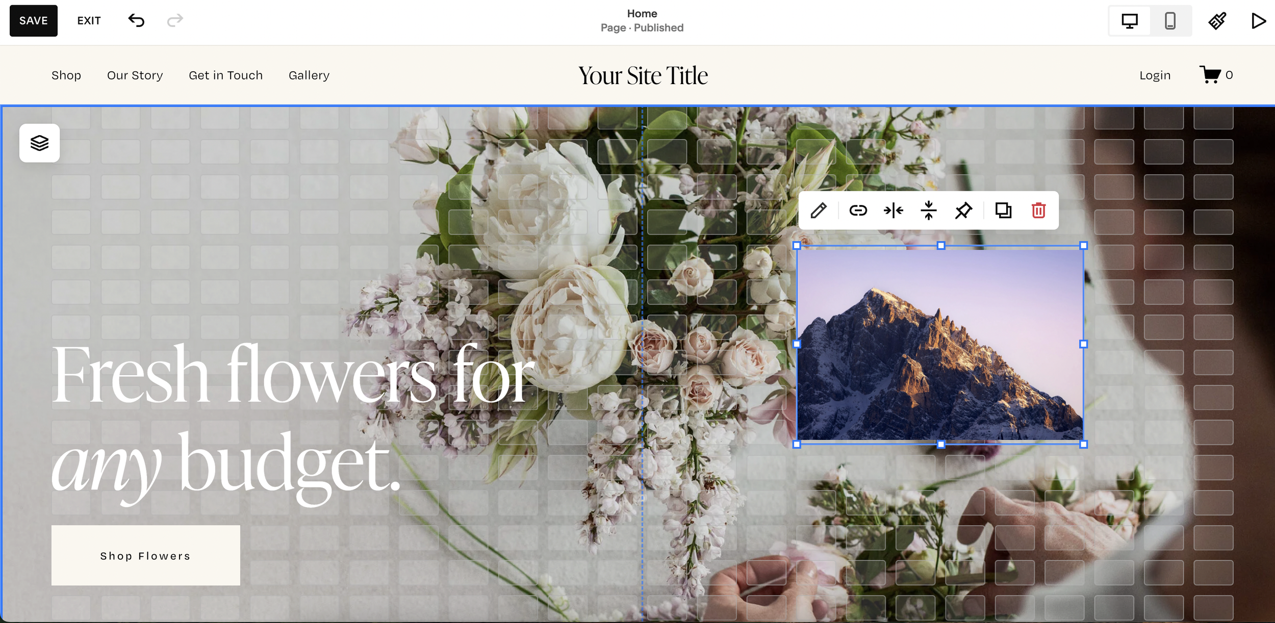
Step 5: Bleed the Image to the Side Edge
To make the image bleed fully to the side of the page:
click the image block
drag it outward toward the page edge
stretch it until it sits flush with the side
For the strongest visual effect, many designers extend the image all the way to the center split of the section.
This creates a polished two-column full bleed layout.
Step 6: Check Mobile Layout
This step is essential.
A layout that looks perfect on desktop can often break on mobile.
Switch to mobile view and check the section carefully.
Common issues include:
image alignment problems
text overlapping
uneven spacing
incorrect vertical stacking
Adjust the image and text placement so everything fits cleanly on smaller screens.
For best results:
drag the image to the top
make sure it spans edge to edge
adjust text padding and spacing
Step 7: Save Your Changes
Once both desktop and mobile layouts look correct, click Save.
You now have a full bleed half-page image section in Squarespace that spans:
top
bottom
side edge
Perfect for modern website design.
Why Use This Layout?
This design style works extremely well for:
luxury brand websites
agency sites
personal brands
service-based businesses
product landing pages
It creates a clean visual contrast between imagery and text while keeping the design balanced.
Final Thoughts
Creating a full bleed image on half of a Squarespace section is much easier with Fluid Engine than it used to be.
The main steps are:
disable Fill Screen
stretch the image vertically
drag it flush to the edge
optimize mobile view
Once you master this technique, it becomes one of the best layouts for building modern, high-converting pages in Squarespace.