


Why Most Websites Fail (And How to Build One That Actually Converts)
Most business owners think their website is doing its job.
It's live. It looks professional enough. It has information about the company, a few images, and a contact form.
But here's the uncomfortable truth: many websites actively cost businesses money.
Not because they're ugly. Not because they're outdated. But because they fail to communicate anything meaningful to visitors.
After analysing hundreds of websites and tracking how real users interact with them, one pattern becomes impossible to ignore:
The websites that generate leads, build trust, and drive revenue all follow the same core principles. Meanwhile, the websites that struggle tend to make the same costly mistakes.
In this guide, we'll break down the most important website design and conversion principles that separate high-performing websites from the rest.
The Biggest Reason Most Websites Fail
The worst websites aren't usually built by people who don't care.
They're built by people who care deeply—but focus on the wrong things.
They spend weeks debating:
Logo placement
Font choices
Brand colours
Hero images
Yet they launch a website with:
No clear messaging
No conversion strategy
No visual hierarchy
No compelling reason for visitors to stay
The result?
A website that exists but doesn't perform.
Having a website and having a website that works are two very different things.
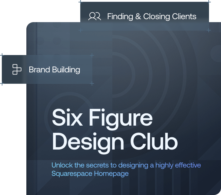
Want a framework for designing the perfect homepage?

Need an expert to build your Squarespace website?
Book a free kick-off call with our team to discuss your project requirements in detail.
Start With Strategy Before Design
Before choosing colours, fonts, or layouts, ask:
What is the goal of the website?
What action should visitors take?
What information do they need before taking that action?
What objections need to be overcome?
The best websites aren't designed around aesthetics.
They're designed around user behaviour.
Every section, headline, image, and button should support a specific business objective.
Master Visual Hierarchy
Visual hierarchy is what guides visitors through your website.
Without it, users become overwhelmed and leave.
The Three Building Blocks of Hierarchy
1. Size
The most important element should be the largest.
Your main headline should immediately stand out from everything around it.
2. Contrast
Important elements should visually separate themselves from the background.
Low-contrast designs often look modern but hurt usability and conversions.
3. Spacing
Give key elements room to breathe.
When everything competes for attention, nothing gets attention.
Why Website Layout Matters
Think of layout as the skeleton of your website.
If the structure is wrong, no amount of decoration can fix it.
Successful websites often use proven reading patterns:
F-Pattern Layout
Users scan:
Left to right
Down slightly
Left to right again
This works particularly well for information-heavy websites.
Z-Pattern Layout
Users move:
Top left
Top right
Diagonally down
Bottom right
This is highly effective for landing pages and conversion-focused websites.
A strong layout naturally guides visitors toward your calls-to-action.
Typography Can Transform Your Brand
Typography has an enormous impact on how people perceive your business.
The same website can feel like:
A local startup
A luxury consultancy
A technology company
Simply by changing the typography.
Typography Best Practices
Use a Maximum of Three Fonts
Ideally:
One heading font
One body font
One optional accent font
Anything more creates visual clutter.
Prioritise Readability
Visitors should never notice how hard they are working to read your content.
If they do, they'll leave.
Create Clear Distinctions
Use:
Font size
Weight
Line spacing
Letter spacing
To create hierarchy between headings, subheadings, and body text.
How Colour Influences Conversions
Before visitors read a single word, they've already formed an impression based on colour.
Colour influences whether a website feels:
Trustworthy
Premium
Modern
Friendly
Professional
Follow the 60-30-10 Rule
A balanced colour palette typically includes:
60% Neutral Colour
Usually white, off-white, grey, or black.
30% Secondary Colour
Used throughout sections and supporting elements.
10% Accent Colour
Reserved for:
Buttons
Calls-to-action
Key highlights
This accent colour often becomes the most important conversion tool on the website.
Invest in Custom Visual Assets
One of the fastest ways to increase perceived value is through custom visuals.
Compare:
Generic Website
Stock photos
Generic icons
Template graphics
Premium Website
Real photography
Custom illustrations
Branded graphics
Bespoke visual systems
The difference is immediate.
Visitors subconsciously associate custom visuals with professionalism, expertise, and credibility.
White Space Is Not Wasted Space
Many business owners worry that white space makes a website feel empty.
The opposite is true.
White space creates:
Clarity
Focus
Premium perception
Better readability
Luxury brands understand this better than anyone.
Every element is given room to breathe.
As a result, every element feels more important.
White space isn't empty.
It's a design tool.
The Hero Section Does Most of the Heavy Lifting
Your hero section is the most important part of your website.
Most visitors never scroll very far.
That means your hero section must answer three questions instantly.
1. What Do You Do?
Avoid vague headlines.
Instead of:
"Innovative solutions for modern businesses"
Try:
"AI Contract Reviews Delivered Directly to Your Inbox in 15 Minutes"
Specificity wins.
2. Why Should I Care?
Highlight your unique value proposition.
What makes you different?
Why should someone choose you instead of a competitor?
3. What Should I Do Next?
Include a clear call-to-action.
Examples:
Book a Demo
Get a Quote
Schedule a Consultation
Start Free Trial
Never leave visitors guessing.
Social Proof Is the Ultimate Trust Builder
People trust other people more than they trust marketing.
That's why social proof is one of the most powerful conversion tools available.
Types of Social Proof
Client Logos
Show who you've worked with.
Testimonials
Share real customer experiences.
Case Studies
Demonstrate measurable results.
Statistics
Highlight meaningful numbers:
Revenue generated
Customers served
Projects completed
Satisfaction scores
Awards and Recognition
Third-party validation builds trust instantly.
Optimise Calls-to-Action for Conversion
Every page should have a clear next step.
A visitor should never wonder:
"What am I supposed to do now?"
Effective CTA Design
Use High Contrast
Your primary CTA should stand out immediately.
Be Specific
Instead of Learn More, try Book a Free Strategy Call
Repeat CTAs Throughout the Page
Visitors convert at different stages.
Place calls-to-action after:
Benefits
Social proof
Case studies
Pricing sections
Make action easy whenever someone is ready.
Build Websites Around User Behaviour
The biggest shift you can make is viewing your website as a conversion system rather than a digital brochure.
Every section should:
Address objections
Build trust
Demonstrate value
Guide visitors forward
The highest-performing websites aren't necessarily the prettiest.
They're simply the easiest to understand.
Final Thoughts
The gap between an average website and a high-performing website isn't usually about budget.
It's about strategy.
Focus on:
Clear messaging
Strong visual hierarchy
Effective typography
Intentional colour choices
Custom visuals
White space
Powerful hero sections
Strategic social proof
Clear calls-to-action
Get those fundamentals right, and your website will do what it was meant to do:
Generate trust, create demand, and convert visitors into customers.