


15 Brutally Honest Web Design Tips That Actually Drive Conversions
After building 750+ websites for everyone from startups to Fortune 500 companies, one thing becomes clear: most web design advice is either painfully obvious, or completely wrong.
If you want a website that actually converts visitors into customers, you need to focus on what works in the real world, not what looks good in a design portfolio.
Here are 15 honest, no-fluff web design principles that will transform your website’s performance.
1. Nobody Reads Your Website
Harsh? Yes. True? Also yes.
Visitors don’t read, they scan.
They:
Skim headlines
Glance at images
Look for quick confirmation they’re in the right place
What to do instead:
Use short paragraphs
Bold key points
Make important info impossible to miss
If your homepage is a wall of text, you’ve already lost them.
2. First Impressions Happen in 0.5 Seconds
This is known as the halo effect.
If your site looks professional instantly, users assume:
Your product is high-quality
Your service is trustworthy
Your business is credible
If it looks cheap? Everything you say becomes questionable.
3. Everyone Knows Your Stock Photos Are Fake
You’ve seen them:
The team high-fiving in a boardroom
The “perfect” office setup
The staged laptop meeting
They don’t build trust, they destroy it.
What works better:
Real team photos
Authentic workspace shots
Slightly imperfect, human imagery
In a world flooded with AI-generated visuals, authenticity stands out.
4. Pretty Websites Don’t Convert, Clear Ones Do
Designers often prioritize aesthetics over clarity.That’s a mistake.
If users can’t quickly understand:
What you do
Who it’s for
How to buy
Then your website is failing, no matter how beautiful it looks.
Clarity is good design.
5. You’re Using Way Too Many Words
Most websites read like essays no one asked for.
Try this:
Cut your copy in half
Then cut it in half again
Every word should earn its place. If removing a sentence doesn’t hurt the page, delete it.
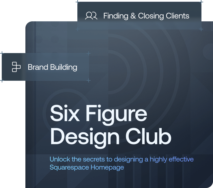
Want a framework for designing the perfect homepage?

Need an expert to build your Squarespace website?
Book a free kick-off call with our team to discuss your project requirements in detail.
6. Stop Hiding Your Pricing
Whether you show pricing or not, you’re filtering visitors.
Hide it - Waste time on unqualified leads
Show it - Attract the right customers
Even a “starting from” price helps. Your website should repel the wrong people as much as it attracts the right ones.
7. If You Look Like Everyone Else, You Compete on Price
Generic websites create commodity businesses. And commodities compete on one thing: price.
To stand out:
Show your process
Inject personality
Highlight your unique value
The best websites feel human, not templated.
8. Slow Websites Kill Conversions
If your site takes more than 3 seconds to load, you could lose nearly half your visitors.
And most business owners don’t even realize their site is slow.
Common culprits:
Uncompressed images
Excessive animations
Bloated plugins
Remember: your users are often on mobile with poor signal, not office Wi-Fi.
9. Over-the-Top Animations Hurt More Than Help
Complex animations might impress designers, but not customers.
They:
Slow down your site
Distract from your message
What works:
Subtle hover effects
Simple fade-ins
Smooth, functional interactions
If people notice your animations more than your offer, something’s wrong.
10. You’re Designing for Yourself (Not Your Customer)
This is one of the biggest mistakes.
Business owners often focus on:
Colors they like
Layouts that impress friends
Copy that sounds clever
But your customer only cares about one thing: “Can you solve my problem?”
Let data guide decisions, not personal preference.
11. You Don’t Need More Pages, You Need Better Ones
More pages = more confusion.
Every extra click is a chance for users to:
Get lost
Get overwhelmed
Leave
Instead:
Consolidate content
Focus on key pages
Make next steps obvious
Clarity always wins.
12. Your About Page Is Wasted Potential
It’s often the second most visited page, and usually the worst written.
Most “About” pages:
Read like resumes
Focus on the company
But visitors want:
Proof
Credibility
Results
Fix it:
Show real numbers (clients served, revenue generated, years of experience)
Share transformations, not timelines
Include real faces and stories
13. Great Websites Repel the Wrong Customers
Trying to appeal to everyone = appealing to no one.
Be clear about:
Who you work with
What you charge
What you stand for
Filtering out bad-fit clients saves time, money, and frustration.
14. Launching Isn’t the Finish Line
Most people treat website launch as the end.
It’s actually the beginning.
After launch, you should:
Track user behavior
Test different layouts and copy
Optimize for conversions
Drive traffic
Your website is a living asset, not a one-time project.
15. People Don’t Want a Website, They Want Results
No one wakes up thinking: “I want to buy a website today.”
They want:
More leads
More sales
More authority
So stop selling features:
Don’t list “responsive design”
Don’t highlight “custom layouts”
Instead, sell the outcome: What changes for them after working with you?
Final Thoughts: Respect Is the Real Conversion Strategy
Great web design isn’t about tricks or manipulation.
It’s about respect:
Respecting your visitor’s time with clarity
Respecting their intelligence with thoughtful design
Respecting their goals by showing real value
If you apply these principles, your website won’t just look better, it will perform better.
Want Better Results From Your Website? Start by auditing your current site against these 15 principles. You’ll likely find a few easy wins that can dramatically improve conversions.
And remember: knowing what works is only half the battle, execution is everything.