


10 Best Medical Website Examples of 2026
Healthcare website design and development has become one of the most competitive and high-stakes areas in digital. According to rater8’s 2025 Patient Choice Report, 84% of patients check online reviews before booking care.
Even Tebra's 6th Annual Patient Perspectives Report says that nearly 8 in 10 patients read reviews before choosing a provider, This means a healthcare website is not only being compared with other providers. But also, it is judged against reviews, search results, and other information patients see elsewhere.
The healthcare websites that perform best in 2026 follow one clear idea: every part of the site, from navigation to colour choices to call-to-action placement, is built to support the patient’s next step. We studied what separates the strongest examples and selected 10 healthcare website examples that show this in practice.
10 Medical Website Examples Built Around the Patient Experience
1. Prova Health
Prova Health’s website creates a strong first impression with a design that feels polished and credible. The dark background paired with clean white typography gives the site a professional, research-driven look without making it feel overwhelming.
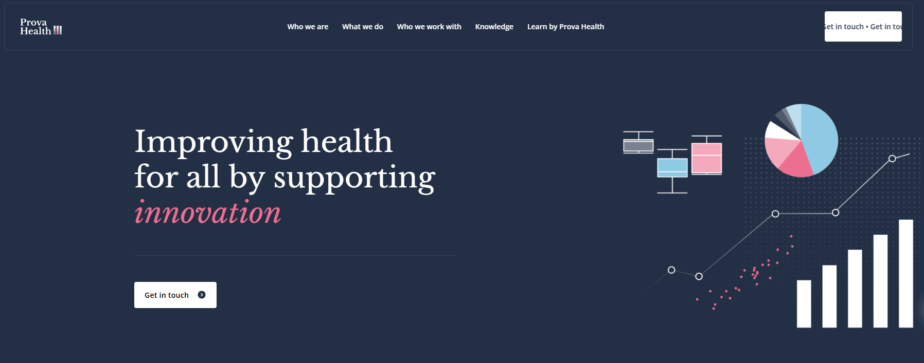
A rotating 3D chart graphic in the hero section immediately highlights the company’s focus on data and analytics. Throughout the site we have built, the combination of italic and bold typography adds visual interest and gives the brand a distinct personality that helps it stand out from more conventional healthcare consulting websites.
Key Features
Rotating 3D chart graphic in the hero section
Italic and bold typographic contrast in headings
Scrolling "Trusted By" client logo strip
Scrolling "Published In" academic journal strip
Audience-segmented navigation under "Who We Work With."
Marquee-style animated "Get in Touch" CTA in navbar
Service cards with hover-reveal read more arrows
2. Slopes Bio
Slopes Bio’s website creates a careful balance between scientific authority and clear commercial communication. This one of the top medical website design examples highlights a clean white layout, paired with a subtle diagonal line texture in the hero section, which adds depth.
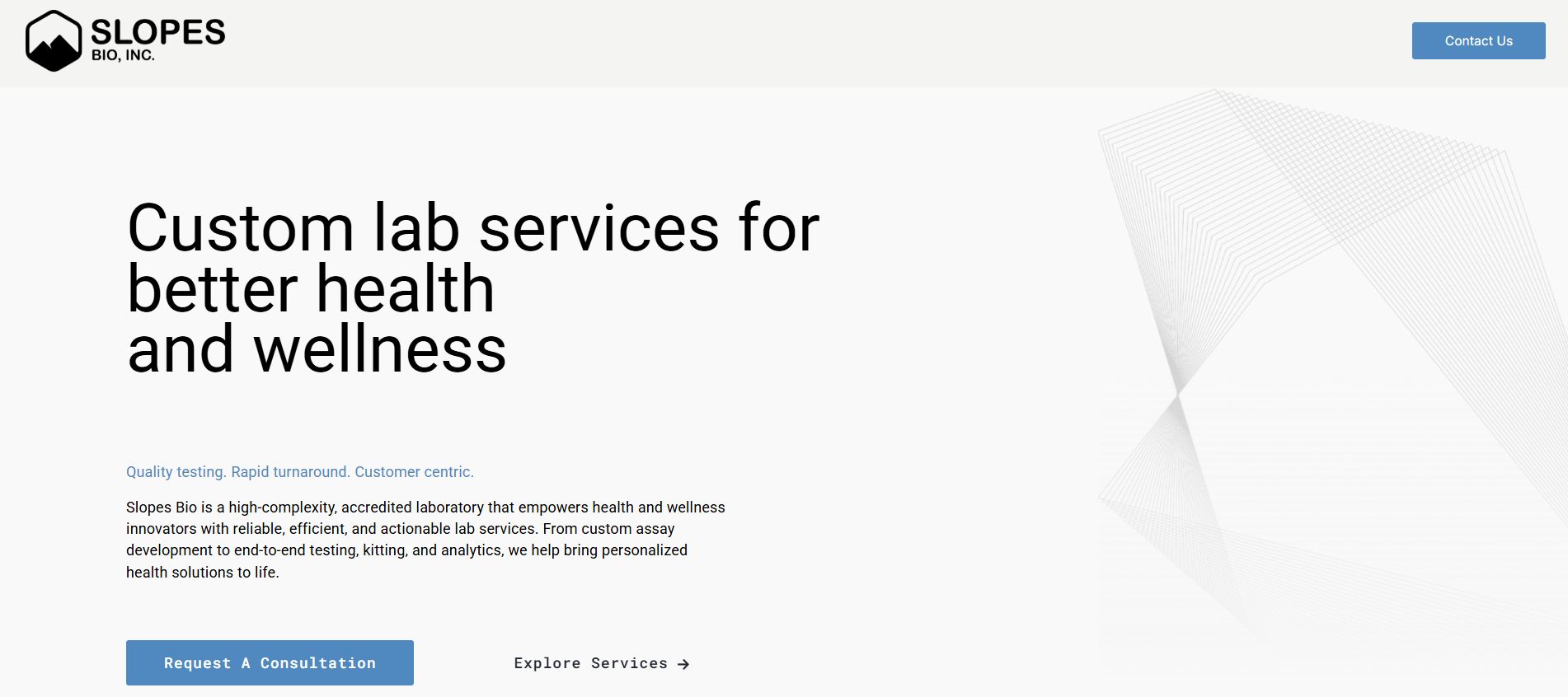
This keeps the overall look precise and professional. Just below the hero, three bold stat counters (250K+ lives informed, 50+ programmes launched, and 30+ years of experience) quickly build credibility before any service details are introduced.
Further down, you will see many unique web design concepts that create a structured, almost lab-like rhythm that highlights the brand’s focus on precision and systematic thinking.
Key Features
Diagonal line texture in the hero background
Three bold stat counters below the hero
Numbered service layout with sequential visual rhythm
Individual "Request Information" CTA per service section
Three-column differentiator cards with custom icons
Chronological news and updates section with dated entries
3. PharosAI
PharosAI’s website presents one of the most ambitious cancer AI missions in the UK in a calm and focused way. A full-screen background video introduces the experience right away, placing visitors inside the scientific world before they read any text.
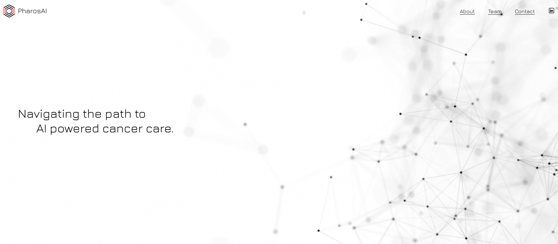
The simple three-item navigation removes distractions and keeps attention on the core mission. The white logo set against the dark video background creates a strong contrast. This adds clarity and purpose, helping the site feel precise and intentional from the start.
Built on HIPAA-compliant Squarespace, the site shows that healthcare platforms can be delivered with the required security, structure, and clinical credibility.
Key Features
Full-screen background video in the hero section
Ultra-minimal three-item navigation bar
White logo on dark video for stark visual contrast
Six NHS and university partner logos below the hero
Single-page structure with About, Team, and Contact
4. Dr. Erika Kao
Dr. Erika Kao's website makes a strong first impression through its dark, warm-toned design that feels nothing like a typical therapy site. It creates an immediate sense of safety and calm.
That feeling matters deeply for anxious patients before they reach out. The single-page layout removes every possible barrier between a visitor and a booking.
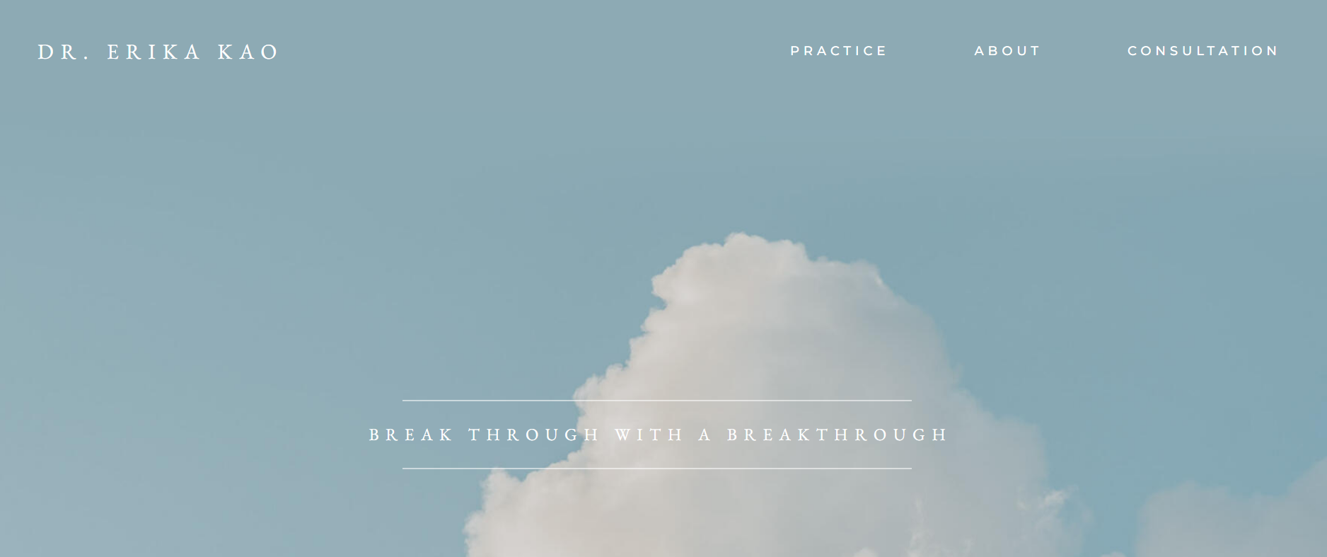
Nothing feels complicated. The first-person tone speaks directly to people feeling stuck, overwhelmed, or disconnected. Patients don't just find a therapist here. They feel genuinely understood before the first session even begins.
Key Features
Single-page design keeps navigation simple
Anchor menu enables quick section access
Warm visual style creates a welcoming feel
The consultation form supports fast inquiries
Transparent pricing helps set expectations
Secure teletherapy booking through SimplePractice
Click-to-call option improves mobile convenience
5. Zocdoc
Zocdoc’s signature yellow homepage instantly feels welcoming and patient-focused. Instead of overwhelming you with options, it centres the experience around one smart search bar. You can describe your needs naturally, and the platform quickly suggests relevant providers.
Meanwhile, insurance filters narrow your choices from the start, saving valuable time. The navigation also serves both patients and providers without feeling cluttered.
As you continue exploring, verified reviews, specialty search tools, and intelligent doctor recommendations work together to create a smooth booking journey.
Key Features
Natural language search bar
Insurance-first filtering system
AI-powered doctor matching
Dual patient and provider navigation
Verified patient reviews
15-plus specialty browsing categories
Mobile app deep-linking from homepage
Split hero CTA for two audiences
6. Athenahealth
Athenahealth is a premium healthcare technology website designed for growth and enhancing the patient experience. The deep purple navigation bar strengthens the brand identity while creating a sense of trust from the moment you land on the site.

A looping hero video shows the platform in action, helping visitors quickly understand what it does without relying on lengthy explanations. Across the solution cards, subtle hover-triggered videos add an interactive touch and give users a clearer sense of the technology behind athenahealth’s services.
Key Features:
Looping brand video in the hero section
Hover-triggered micro-videos on solution cards
Mega menu with five structured categories
Challenge-based resource filtering system
Scrolling client logo strip below hero
Dual login portals in the top navigation bar
Persistent "Request a Demo" CTA in navbar
7. Parsley Health
Parsley Health’s website takes a different approach from traditional healthcare websites. Warm, earthy tones and natural photography create a welcoming and reassuring first impression. The hero headline, “Care that helps you feel better and stay well,” speaks directly to people looking for a more personalised healthcare experience.
Just below, a continuously scrolling trust ticker highlights insurance acceptance, board-certified clinicians, and more than 50,000 members served.
It gives visitors key credibility signals before they even begin exploring the site.
Key Features
Warm earthy bone-white colour palette
Scrolling trust ticker below hero
Animated outcome percentage counter
Step-by-step care journey flow section
Condition-based browsing with abstract imagery
Insurance eligibility CTA mid-page
Named star-rated patient testimonials
Founder profile in clinician trust section
8. CariFree
CariFree’s website stands out from many generic dental brands with a design that feels both professional and approachable. The clean blue-and-white colour palette creates a strong healthcare presence without feeling overly clinical.
Its hero headline addresses a common frustration, like people who take good care of their teeth but still struggle with cavities. From the start, the navigation clearly separates paths for consumers and dental professionals, helping each audience find relevant information without adding unnecessary complexity.
Key Features
Dual-audience split CTA in the hero section
Media features a logo strip for instant credibility
Patented pH+ Technology highlighted as a unique differentiator
Three-step routine visual product flow
Risk assessment quiz in the main navigation
Dentist finder tool integrated into the learn section
Separate professional portal via carifreepro.com
9. DrDoctor
DrDoctor’s website feels purpose-built for the NHS from the moment you arrive. The deep green-and-white colour palette creates a professional healthcare feel while remaining welcoming and easy to navigate.
The hero headline, “Behind every great patient experience lies DrDoctor,” highlights the platform’s role in supporting healthcare providers behind the scenes rather than putting the technology itself in the spotlight.
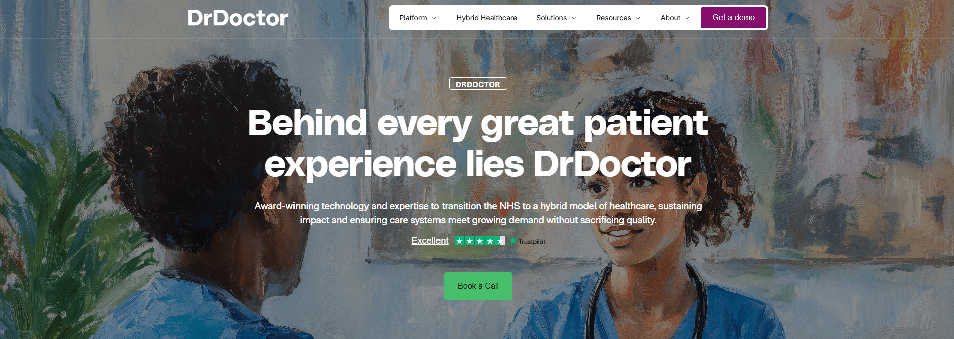
A tabbed use-case section further improves the experience by allowing NHS decision-makers to jump straight to the challenges most relevant to them.
Key Features
Use-case selector for quick access to specific challenges.
HybridOS is presented as a standalone platform.
Role-based navigation for different user groups.
Care setting filters for various NHS environments.
Trustpilot rating displayed in the hero section.
Case study previews are built into the mega menu.
Animated stats highlighting key outcomes.
10. Alto Pharmacy
Alto Pharmacy’s website feels very different from a traditional pharmacy experience. The minimal navigation removes unnecessary distractions and keeps the focus on getting started.
A prominently placed app mockup immediately signals that the service is designed with mobile users in mind. Instead of relying on clinical stock imagery, the site uses warm, lifestyle-focused photography that feels more personal and approachable.
Each section naturally leads into the next, helping visitors understand the service without overwhelming them with information.
Key Features
Angled app mockup in the hero section
Minimalist three-item navigation bar
Warm caramel-toned photography throughout
Progressive four-step onboarding flow mid-page
Interactive delivery coverage map with location finder
Dedicated fertility care section with a distinct visual tone
Rotating named customer testimonials mid-page
Ready to Build a Medical Website That Stands Out and Converts?
At by Crawford, we build medical websites on Squarespace that are engineered for trust, speed, and conversion from the ground up. Sam Crawford is an award-winning Squarespace Expert, Enterprise Partner, and Circle Member with 700+ sites launched across 30+ countries and 5 industry awards.
We have built dark authority-driven platforms for cancer AI research consortiums, precision laboratory service companies, and evidence-based health consultancies targeting pharma and NHS decision-makers. Three of the websites on this very list: Prova Health, Slopes Bio, and PharosAI were built by us.
Every site starts with wireframes, structured content architecture, and a design system built specifically around your audience's trust triggers and conversion journey.
If you are ready to build a medical website that belongs on a list like this, we would love to help.