


Center Your Mobile Buttons on Mobile Squarespace
Squarespace has been steadily improving its mobile editing features, giving website owners more flexibility when designing responsive layouts. One of the most useful recent updates is the ability to use different button alignments on mobile and desktop independently.
Previously, if you centered a button on mobile, it would also center on desktop, and vice versa. This made responsive design frustrating for many Squarespace users.
Thankfully, Squarespace has now fixed this issue.
In this guide, you’ll learn exactly how to center buttons on mobile in Squarespace while keeping desktop alignment unchanged.
Why Independent Mobile Button Alignment Matters
Responsive design is essential for modern websites. A layout that looks great on desktop doesn’t always translate well to smaller mobile screens.
Being able to independently control button alignment allows you to:
Improve mobile user experience
Create cleaner mobile layouts
Increase button visibility on small screens
Maintain desktop design consistency
Build more professional-looking Squarespace websites
For example:
Left-aligned buttons may work well on desktop
Centered buttons often look better on mobile
Now you can have both.

Want a framework for designing the perfect homepage?

Need an expert to build your Squarespace website?
Book a free kick-off call with our team to discuss your project requirements in detail.
How to Center Buttons on Mobile in Squarespace
Follow these simple steps.
Step 1: Open the Squarespace Editor
Log into your Squarespace website and navigate to the page you want to edit.
Click:
Edit
This opens the visual page editor.
Step 2: Locate Your Button Block
Scroll through the page until you find the button you want to adjust.
On desktop, your button may currently be:
Left-aligned
Center-aligned
Right-aligned
In this example, the button starts as left-aligned.
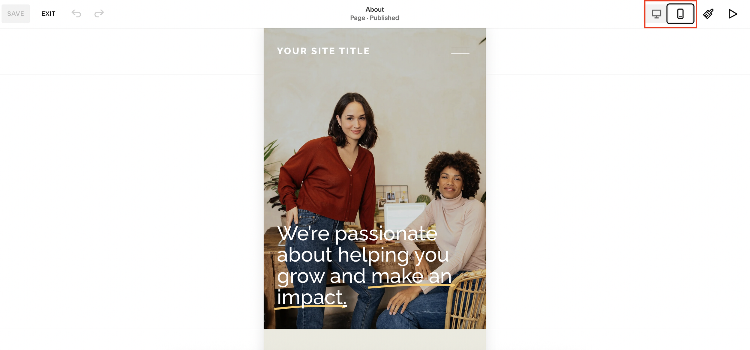
Step 3: Switch to Mobile View
At the top of the editor, switch from desktop preview to mobile preview.
You’ll notice the button currently matches the desktop alignment.
Previously, changing the alignment here would also affect desktop layouts.
Now, Squarespace allows independent control.
Step 4: Edit the Mobile Button Alignment
Click the button’s Edit icon.
Inside the settings:
Find the Alignment option
Change it to Center
That’s it.
Step 5: Check Desktop Alignment
Switch back to desktop preview.
You’ll now see:
Desktop button remains left-aligned
Mobile button is centered
The two layouts are now completely independent.
What This Squarespace Update Improves
This feature gives users far more granular control over responsive design.
Before the Update
Mobile and desktop button alignment were linked
Editing one affected the other
Responsive layouts were harder to customize
After the Update
Mobile and desktop alignments are separate
You can optimize layouts for each device
Designing responsive websites is much easier
This has been one of the most requested usability improvements from Squarespace users.
Best Practices for Mobile Button Alignment
Center Buttons on Mobile When:
Buttons sit below centered text
You want stronger call-to-action visibility
Your mobile layout feels unbalanced
You’re designing landing pages or sales pages
Keep Buttons Left-Aligned When:
Your content is left-aligned
You want a more editorial layout
Your design relies on structured text flow
There’s no universal rule, the best alignment depends on your website design and user experience goals.
Why Responsive Design Matters for SEO
Mobile usability is a major ranking factor for search engines.
Improving your mobile layout can help:
Reduce bounce rates
Increase engagement
Improve accessibility
Create a better user experience
Support SEO performance
Small design improvements like better button alignment can make a noticeable difference in how users interact with your site.
Final Thoughts
Squarespace’s new independent mobile alignment controls are a simple but important upgrade for responsive website design.
You can now:
Center buttons on mobile
Keep desktop layouts unchanged
Create cleaner responsive designs
Improve user experience across devices
If you’ve struggled with mobile layout limitations in Squarespace before, this update makes customization much easier.