


Copy This Website, It’ll Blow Up Your Business
Could a website redesign single-handedly transform your business? After completing a full rebuild for an enterprise SaaS company, the answer is a resounding yes.
This site went from a dated corporate brochure to a modern, high-converting machine, and every principle we used is completely replicable, regardless of your industry. Here's exactly what we changed, why it worked, and how you can apply the same framework to your own website today.
What Was Wrong With the Old Website
Before we get into the solution, it's worth understanding the problems, because they're more common than you'd think.
The hero headline was a question. Questions are weak H1s. They put the burden of an answer on the visitor, forcing them to think. When someone lands on your website, they don't want to think, they want to immediately understand what you do and why they should care.
The copy was long and jargon-heavy. Phrases like "digital transformation journey" and "revolutionize the way you do business" could apply to any consulting firm on the planet. No specificity means no real point of view, and no point of view means no reason to stay.
There was no real imagery. Generic icons don't build trust. They fill space. Without real people, there's no sense of what it's actually like to work with the company.
Information overload. Compliance language, government programs, certifications, affiliations, all of it was competing for attention on the same page, with no structure. Visitors were landing, feeling overwhelmed, and bouncing.
Unclear navigation. Six menu items, Who We Are, What We Do, Why We Do It, Where We Work, Partner, Support, with no clear hierarchy and no obvious next step for a new visitor.
The overall feeling? Dated. In 2026, your website is not a brochure. It's a sales machine, a trust builder, and the first impression your prospect gets of your company.
Want a framework for designing the perfect homepage?

Need an expert to build your Squarespace website?
Book a free kick-off call with our team to discuss your project requirements in detail.
The 5-Principle Framework We Used to Rebuild It
Principle 1: Confidence Over Questions
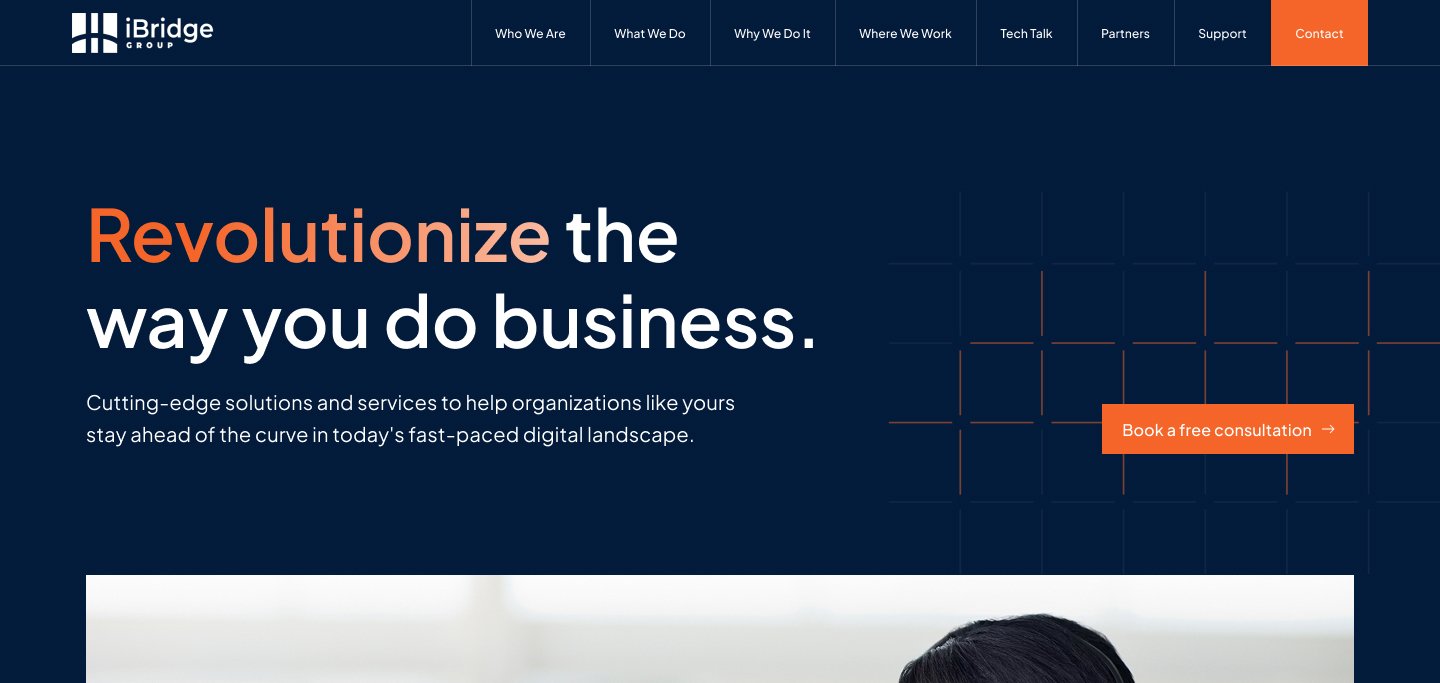
The new hero headline: "Revolutionize the way you do business."
That's a statement. It projects confidence. It delivers the dream outcome immediately, without asking the visitor if they're ready for it. The word "revolutionize" is highlighted in a bold accent colour, it's the main action word, and it demands attention.
The supporting copy is short: "Cutting-edge solutions and services to help organisations like yours stay ahead of the curve in today's fast-paced digital landscape." Yes, it's still fairly broad, but here's the key difference: it's a supporting line, not the main event. The headline does the heavy lifting. The subtext reinforces it without overwhelming it.
The rule: Your H1 should be a confident statement of what you do and the outcome you deliver. Save the detail for everything below it.
Principle 2: Visual Hierarchy
On the old site, everything competed for attention equally, which meant nothing actually stood out.
The new site creates a clear, intentional hierarchy:
Hero - the core value proposition, front and centre
Three core pillars - Who we are, Industries we support, Why we do it
Supporting content - programs, affiliations, credibility signals
The same information exists on both sites. The difference is organisation. Each section now has its own space, its own breathing room, and its own visual weight relative to its importance.
Principle 3: Simplify Navigation
The navigation went from six vague menu items to six crystal-clear ones: About, Solutions, Tech Talk, Partners, Support, Contact.
Every item is immediately understandable. No thinking required.
The standout addition is Tech Talk - a content and insights hub. This does more than just add a page. It positions the company as a genuine thought leader. It signals: we don't just implement solutions, we think deeply about this industry. That's a powerful credibility signal that most SaaS companies are leaving on the table.
Principle 4: Reorganise, Don't Delete
This is one of the most important lessons from this project.
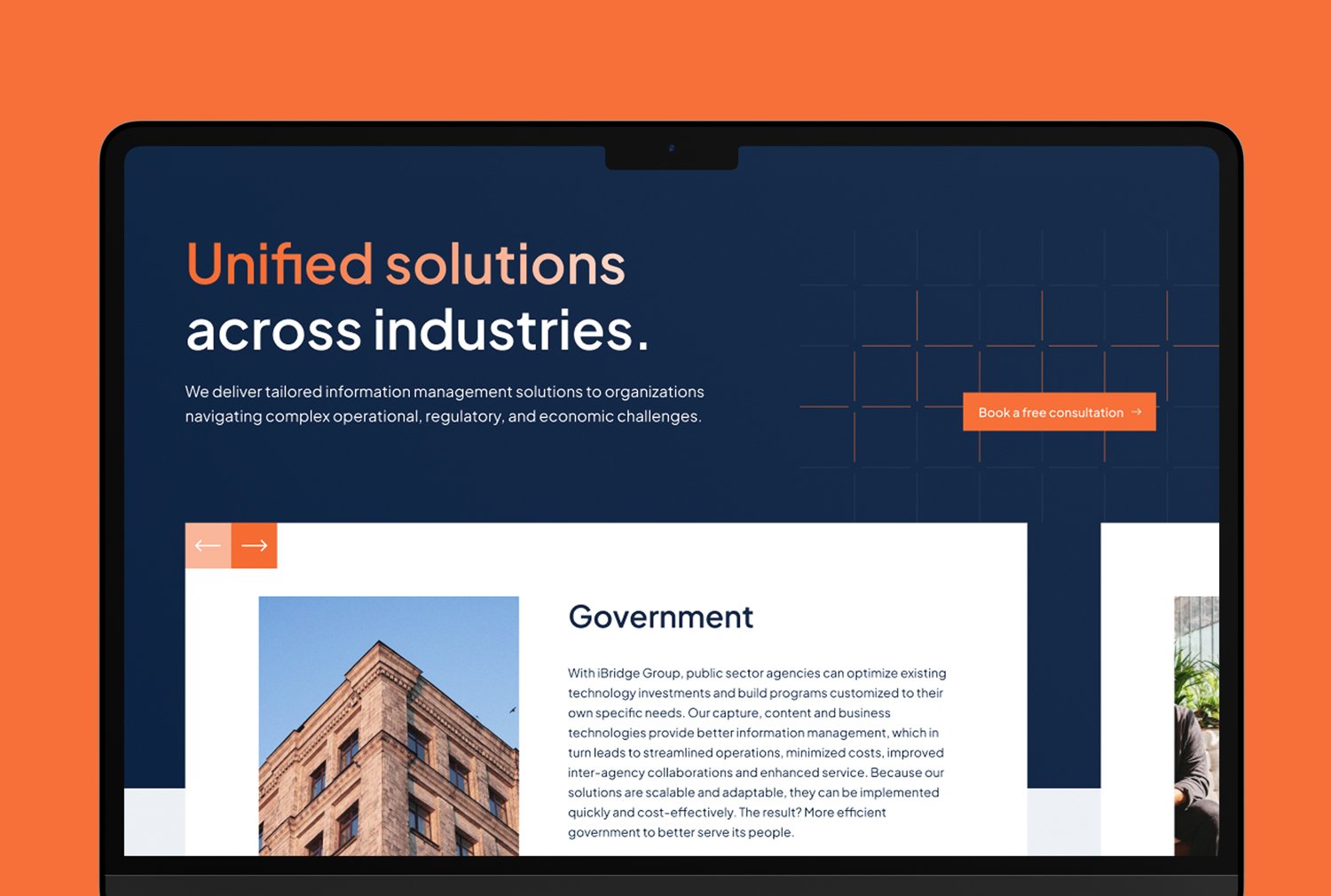
The government program information, DIR, cooperatives, certifications, purchasing affiliations, is genuinely important to what this client does. The instinct might be to cut it to simplify the site. That would be a mistake.
Instead, we reorganised it. In the old site, it dominated the page and stole focus from the core value proposition. In the new site, it has its own clearly labelled section, further down the page. The affiliations are in a compact carousel, still visible, still credible, but not consuming valuable real estate.
The principle: You don't need to delete important information. You need to give it the right level of prominence, no more, no less.

Principle 5: Real Imagery
This one is subtle but its impact is significant.
The old site relied on generic icons. The new site uses real people, professionals, team members, humans with faces.
Why does this matter? Because when a visitor sees a real person, their brain processes it differently. It triggers trust in a way that no icon or illustration can replicate. It makes the company feel real, approachable, and genuinely invested in solving your problem.
If you're using stock photography or generic icons as a crutch, replacing them with authentic imagery is one of the highest-ROI changes you can make.
How to Apply This to Your Own Website
Work through these five audits:
1. Audit your hero section
Are you asking a question or making a statement? Change questions to statements.
Can your copy be read and understood in under five seconds? If not, cut it down.
Do you have real imagery, or are you relying on icons and stock photos?
2. Review your navigation
Is every menu item immediately clear to a first-time visitor?
Do you have more than seven items? If so, consolidate.
3. Map your content hierarchy
What's your most important information? It should be first, big, and bold.
What's supporting information? Second tier, smaller.
What's nice-to-have? Bottom of the page or a separate page entirely.
4. Audit your credibility signals
Are your affiliations, certifications, or client logos overwhelming the page?
If yes, move them to their own section or consolidate them into a carousel.
5. Check your visual design
Does your site feel current or dated?
Are you using bold accent colours on your key action words?
Do you have enough white space, or is everything cramped together?
What Results to Expect
Based on similar enterprise redesigns, the outcomes typically include:
A significant drop in bounce rate - visitors aren't overwhelmed, so they stay longer
An increase in consultation bookings - the CTA is visible, obvious, and uncluttered
Higher quality leads - clear messaging attracts prospects who already understand what you do and are ready to have a real conversation
A website redesign of this nature typically results in a 30–50% increase in qualified lead generation for enterprise clients. That's the difference between a website that's a cost on the business and one that's a genuine revenue driver.
The Bottom Line
A clean structure and clear messaging will get you about 80% of the way to a high-performing website. The fundamentals covered here, confident headlines, visual hierarchy, simplified navigation, smart content organisation, and real imagery, are the foundation every business website needs.
The remaining 20% is about making your site feel premium: the specific design decisions that separate sites people want to buy from, from the ones they immediately want to leave.