


How to Change Your Page Width on Squarespace
One of the most common mistakes new Squarespace users make is not setting an appropriate page width for their website. While it might sound like a small detail, your page width has a huge impact on how your site looks across different screen sizes, from laptops to large desktop monitors.
In this guide, we’ll cover:
What page width in Squarespace actually means
Why setting a maximum width is essential for good design
How to find and adjust your max page width setting
My recommended width for most Squarespace websites
What Is Page Width in Squarespace?
In simple terms, your page width determines how wide your site’s content can stretch across the screen.
If someone views your website on a large desktop monitor, Squarespace will automatically stretch the design to fill the available space. That might sound good in theory, more space, more visibility, but in practice, it can make your site look disproportionate and unprofessional.
Text blocks, images, and buttons start to drift apart, leaving awkward gaps and breaking your design’s visual balance.

Want a framework for designing the perfect homepage?

Need an expert to build your Squarespace website?
Book a free kick-off call with our team to discuss your project requirements in detail.
Why You Should Set a Maximum Page Width
When your site elements are allowed to stretch too far, the result is often:
Poor readability - lines of text become too wide to follow comfortably
Broken layout alignment - buttons, images, and headings lose structure
Inconsistent design across different screens
By setting a maximum page width, you ensure your layout stays consistent and visually appealing on all devices. It keeps your site compact, easier to read, and more professional-looking.
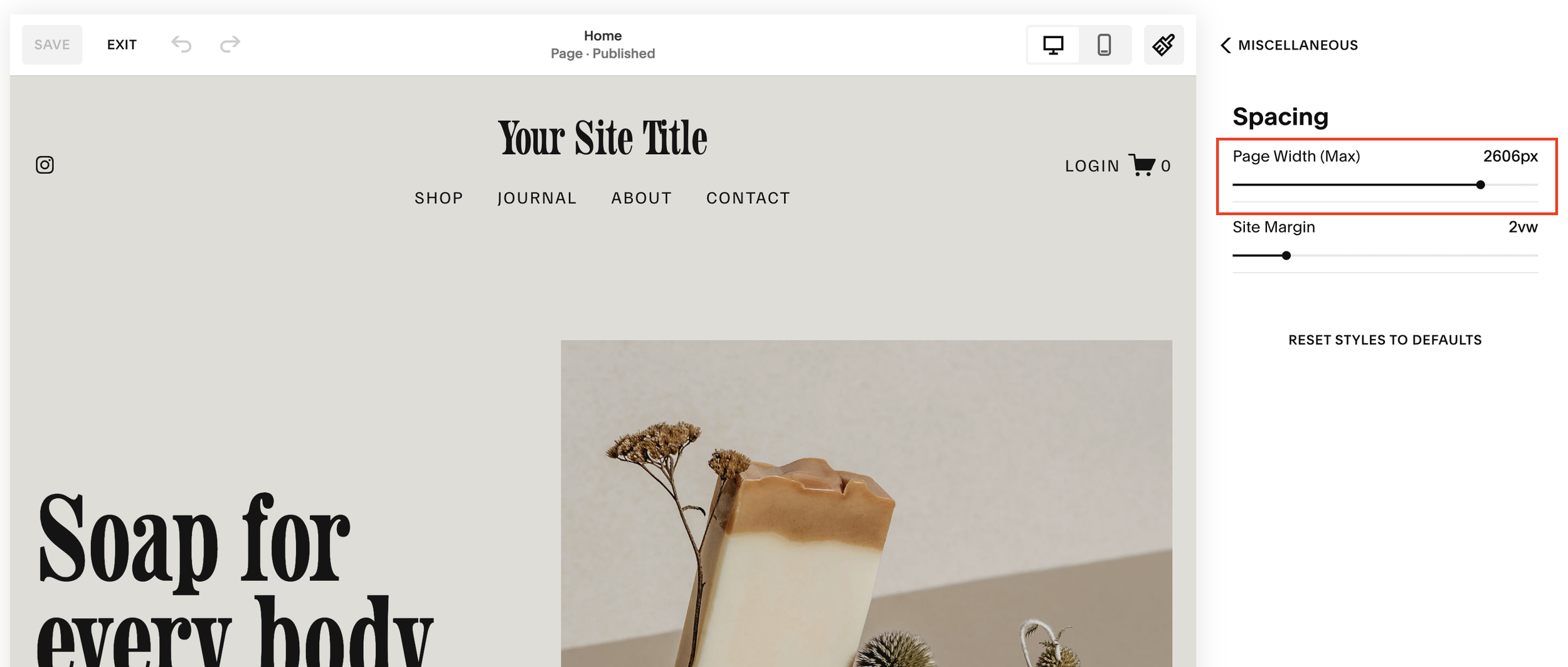
How to Adjust Page Width in Squarespace
Finding the page width setting in Squarespace isn’t immediately obvious, but here’s how to do it:
Go to your Squarespace dashboard.
Open the Site Styles panel, you can access it from the top or side menu.
Scroll down to Miscellaneous.
Click Spacing.
Locate Max Page Width.
This is where you’ll set the upper limit for how wide your site can stretch.
My Recommended Page Width for Most Squarespace Sites
When many users first start designing in Squarespace, they’re tempted to crank up the width, say, 3000px, thinking it’ll look great on large screens. But this actually makes your design fall apart visually, creating too much white space and poorly spaced elements.
A much better setting is around 1440px (1,440 pixels).
This width works beautifully across most devices, keeping your layout clean, centered, and proportional. It also mirrors what many professional web designers use for modern, responsive layouts.
Final Thoughts: Keep It Tight and Consistent
Understanding and controlling your page width in Squarespace is one of the simplest ways to elevate your site’s design. By keeping your content within a set boundary, you’ll ensure:
A cleaner, more professional layout
Better user experience on large and small screens
Easier design consistency across pages
It’s a small tweak that makes a big difference.