


How to Change Your Site Margin Width on Squarespace
When designing in Squarespace, one of the most common mistakes I see is how people handle section margins.
Many users, when they want more space on the sides of a section, simply drag content blocks inward. While this can work visually in the moment, it’s not the most efficient or consistent way to control spacing across your site.
In this post, I’ll show you the right way to manage margins in Squarespace so your design stays aligned, balanced, and professional across every page.
The Problem with Manually Moving Blocks
Let’s say you’re editing a section and decide you want more breathing room on the sides. You drag your text or image blocks inward, and at first glance, it looks okay.
But here’s the issue:
Your header and footer elements stay in their original position.
Other sections across the site don’t match this adjustment.
You end up having to manually move blocks on every section, a time-consuming and inconsistent process.
Even switching your header layout to “Inset” doesn’t fully fix this alignment problem. The result? A site that feels disjointed, with mismatched spacing from section to section.

Want a framework for designing the perfect homepage?

Need an expert to build your Squarespace website?
Book a free kick-off call with our team to discuss your project requirements in detail.
The Right Way: Use Site Styles to Adjust Margins
Instead of manually shifting blocks, you should use the built-in margin settings within Site Styles. This ensures your entire website aligns properly, from your header logo to your footer links.
Here’s how to do it:
Open your Squarespace dashboard.
Click Edit on any page.
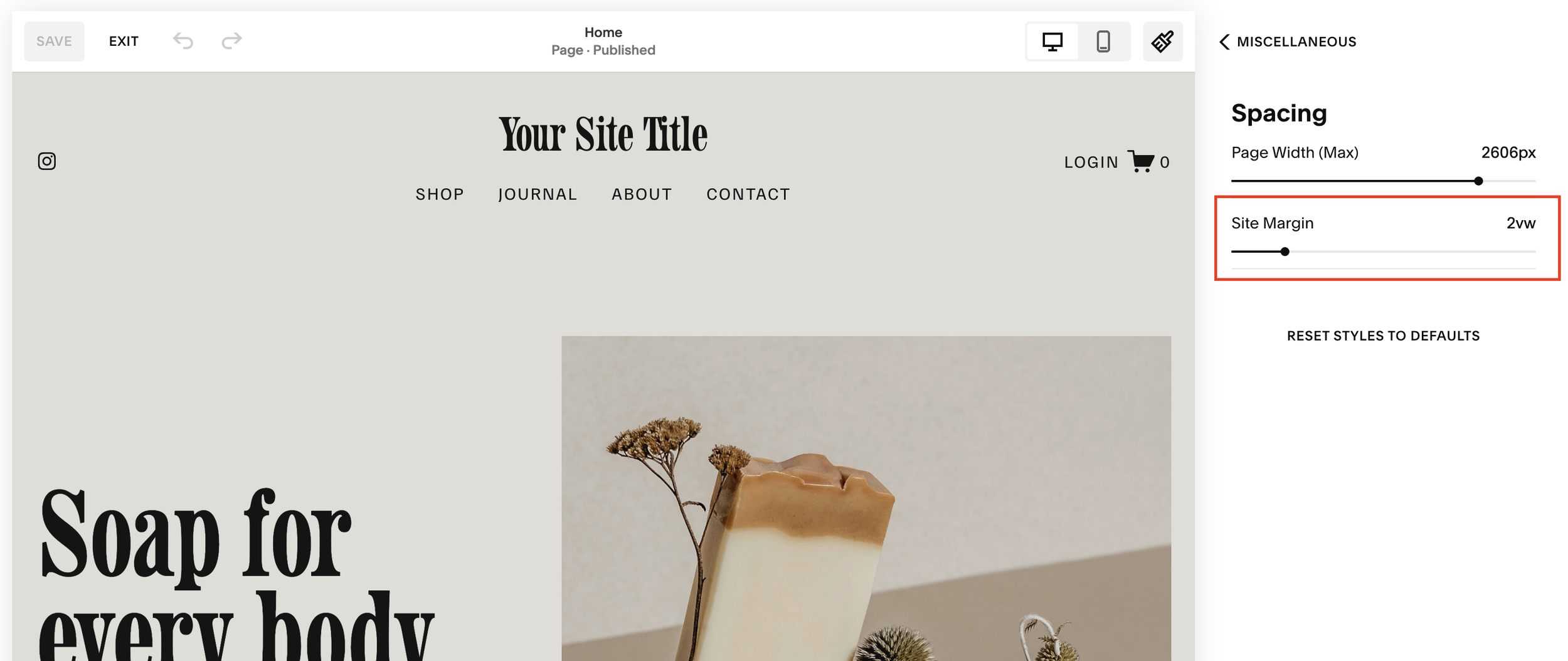
In the top menu, open Site Styles (you can also access this via the left-hand panel).
Scroll down to Miscellaneous > Spacing.
Here, you’ll find two important settings:
Max Page Width - controls how wide your content can stretch.
Margin - controls the space on the left and right sides of your page.
Finding the Perfect Margin Setting
Squarespace allows you to adjust your margins from 0 to 12:
0 means everything sits flush to the edge of the browser.
12 brings all your content heavily inward toward the center.
Through experience, I’ve found a margin of 4 or 5 gives a balanced, professional layout for most designs.
Margin 4: Great for modern, clean layouts.
Margin 5–6: Ideal if you want a slightly tighter, more focused design.
Once you save your settings, you’ll notice the difference immediately:
Your logo, header, and page content all align perfectly.
The same spacing applies across the site, creating a cohesive visual flow.
You no longer have to manually adjust each section, Squarespace does it for you.
Why Consistent Margins Matter
Cohesion is everything in web design. When your spacing is consistent across all sections, it gives your website a professional and intentional look.
Proper margins help with:
Visual balance - everything aligns naturally.
User experience - visitors find it easier to read and navigate.
Brand credibility - consistent design communicates quality and attention to detail.
It’s a small adjustment that makes a huge difference in how your site feels and functions.
Final Thoughts
If you’ve been manually dragging blocks to adjust spacing, try using the Site Styles > Spacing > Margin settings instead. This approach not only saves time but ensures your entire Squarespace website maintains consistent alignment from top to bottom.
For most sites, a margin of 4 or 5 hits the perfect balance between clean and comfortable.