


The Psychology of Premium Websites: 3 Principles That Separate Cheap from High-End
You land on a website and within seconds you just know it is premium. Use our free website quality checklist to audit whether your own site creates that same instant impression. It's not one specific thing you can point to, it's a feeling. A sense of quality, trust, and authority.
That feeling isn't an accident. It's a deliberate result of applied psychology.
In this post, we're going to reveal the three core psychological principles that separate cheap-feeling websites from premium ones, show you how the world's top brands use them, and give you a practical framework to apply them to your own site today.
Why Your Website Feels Cheap (Or Premium) Without Anyone Knowing Why
Most website owners focus on colours, fonts, and content. But the real reason some sites feel expensive, and others don't, operates at a deeper level. It's psychological. And once you understand the principles behind it, you can't unsee them.
Let's break them down.
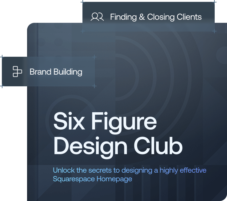
Want a framework for designing the perfect homepage?

Need an expert to build your Squarespace website?
Book a free kick-off call with our team to discuss your project requirements in detail.
Principle 1: The Halo Effect - Engineer Your First Impression
Studies have shown that it takes just 50 milliseconds for a visitor to form an opinion about your website. That first impression then colours every judgment they make about everything that follows, your product, your service, your credibility as a business.
This is the Halo Effect: our brain's tendency to let an initial impression define our overall perception.
If the first thing a visitor sees looks professional, clean, and high quality, their brain automatically assumes your products and services are equally high quality. But the reverse is also true. A cheap-looking header, a cluttered layout, or low-quality imagery in that first view creates a negative halo, even if the rest of your site is brilliant. The visitor is now seeing everything through a lens of scepticism.
The most important real estate on your entire website is your hero section, the part visible without scrolling. Premium brands don't just design a homepage, they engineer that first impression with precision.
Principle 2: Cognitive Load - Make It Effortless
Our brains are designed to conserve energy. When faced with something confusing or hard to process, the brain has to work harder and that extra mental effort creates stress. Psychologists call this cognitive load.
A website with high cognitive load feels chaotic and unprofessional. A website that is simple, clear, and intuitive creates the opposite: cognitive fluency. And here's the key insight, our brains interpret things that are easy to process as being better, more trustworthy, and higher quality.
A cheap website is often a mess of competing elements where your eye doesn't know where to go. A premium website, by contrast, is a masterclass in clarity:
It uses white space generously, giving content room to breathe
It has a clear visual hierarchy that guides the eye naturally
Its navigation is simple and predictable
This isn't just about aesthetics, it's about psychology. By reducing the mental effort required to use a site, premium brands make you feel calm, in control, and confident in their professionalism.
Principle 3: Micro Interactions - The Details That Create Magic
This is where the real magic happens. Micro interactions are the small, often subtle animations and feedback moments that occur as you interact with a site:
A button that gently changes colour on hover
A form field that gives positive feedback when filled in correctly
A smooth page transition as you scroll
These might seem insignificant, but they have an outsized psychological impact, thanks to something called the Peak-End Rule.
The Peak-End Rule states that people don't remember an experience as an average of every moment. They remember its most intense points (the peaks) and how it ended. Micro interactions are specifically designed to create small peaks of positive emotion, a satisfying click, a smooth animation, or a helpful confirmation.
Cheap websites are static and lifeless. Premium websites feel alive. They signal that the creator cared enough about the user's experience to obsess over even the smallest moments. And when those moments are sprinkled throughout a site, they add up to a powerful overall feeling of quality and craftsmanship.
How the World's Top Brands Apply These Principles
Apple - Masters of the Halo Effect
Land on Apple's website and you're greeted with a stunning full-screen product image and a single bold headline. It's minimalist, confident, and immediately signals premium. Cognitive load is near zero, it's almost impossible to feel confused. And their micro interactions, from the way pages scroll to the way menus open, are famously smooth and satisfying.
Maison Margiela & Bottega Veneta - The Power of White Space
Luxury fashion brands use extreme white space to create a feeling of exclusivity and calm. That empty space isn't wasted, it's a psychological cue that says: we are so confident in what we offer, we don't need to shout. Cognitive load is reduced to an absolute minimum, directing your attention entirely to their products.
This principle extends beyond the screen. The same psychology applies in physical spaces too. Premium interior designers like Wendi Gee Interiors in Austin, Texas apply the same philosophy to residential homes, using restraint, intentional layering, and considered negative space to create interiors that feel effortlessly high-end. Your home and your website are both first impressions. The psychological principles behind making either feel premium are remarkably similar."
Stripe & Figma - Trust Through Clarity
Top-tier software companies create a powerful halo of innovation and trustworthiness. They use clean, logical layouts to reduce cognitive load and make complex products feel simple and approachable. Their sites don't just inform, they reassure.
All of these brands understand that a website isn't a brochure. It's a psychological experience.
A 3-Step Framework to Make Your Website Feel More Premium
Step 1: Engineer Your First Impression
Don't just design your homepage, obsess over the top half of it. Ask yourself: what is the single feeling I want a visitor to have in the first 50 milliseconds? Is it calm? Confidence? Excitement?
Build your entire hero section around creating that powerful, positive halo effect.
Step 2: Declare War on Cognitive Load
Go through every page of your site and ask: what can I remove? Simplify your navigation. Increase your white space. Create a clear visual hierarchy with one primary goal per section. Make clarity your number one priority and remember, what feels simple to you might still be confusing to a first-time visitor.
Step 3: Hunt for Micro Interaction Opportunities
Look for every place you can add a small moment of delight. How do your buttons feel on hover? What happens when a page loads? How does your site respond as the user scrolls? These details aren't extras, they're the essence of a premium experience. They show that you care.
The Bottom Line
The psychology of a premium website isn't about tricks or manipulation. It's about respect - respecting your visitor's time by being clear and simple, respecting their intelligence by providing a thoughtful, well-crafted experience, and respecting their emotional response by creating moments of genuine delight.
Apply these three principles, the Halo Effect, Cognitive Load reduction, and Micro Interactions, and your website won't just look better. It will feel premium. And that feeling is what turns visitors into buyers.