


How to Add a Chart to Your Squarespace Website (Step-by-Step Guide)
If you've been building Squarespace websites for any length of time, there's a good chance you've never used the chart block, and you're not alone. It's one of the most overlooked features in the entire platform. But if you need to display data visually on your site, Squarespace's built-in chart tool is a genuinely powerful option that requires zero third-party plugins.
In this guide, you'll learn exactly how to add a chart to any page on your Squarespace site, choose the right chart type for your data, and customize it to match your brand.
Why Use Charts on Your Squarespace Website?
Charts and data visualisations help visitors understand complex information quickly. Whether you're showcasing market research, comparing services, or presenting business statistics, an interactive chart is far more engaging than a wall of text or a static table.
Squarespace makes this surprisingly easy, and the charts are interactive by default, meaning visitors can hover over data points for more detail without any extra setup on your part.

Want a framework for designing the perfect homepage?

Need an expert to build your Squarespace website?
Book a free kick-off call with our team to discuss your project requirements in detail.
How to Add a Chart Block in Squarespace
Step 1: Open the Page Editor
Navigate to the page where you want to add the chart. Click Edit to open the Squarespace page editor.
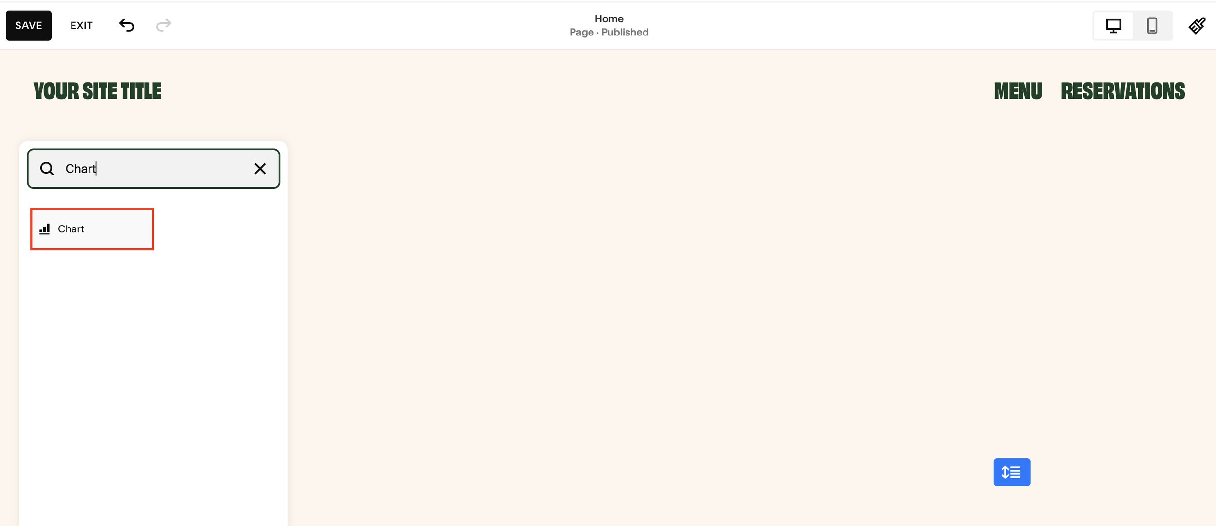
Step 2: Add a New Block
Click the + icon to add a new block in the section where you'd like the chart to appear. In the block search bar, type "Chart" to filter the results, then select the Chart block from the list.
Step 3: Resize the Chart Block
Once added, the chart will appear with some default filler content. You can drag the edges of the block to resize it to fit your layout, aim for something that fills the content width naturally without overwhelming the rest of the page.
How to Customise Your Squarespace Chart
Double-click on the chart block to open the settings panel. You'll see two main sections: Design and Data.
Design Options
Colour Palette - Choose from several preset palettes to match your site's branding. Options include greyscale, complementary, and vibrant colour schemes.
Chart Title - Add a descriptive title that clearly explains what the data represents. This is important both for user experience and for accessibility.
Caption - Optionally add a caption below the chart for additional context or a data source attribution.
Legend - Toggle the legend on or off. The legend displays a colour key showing what each data series represents, useful when you have multiple data sets on a single chart.
Choosing Your Chart Type
Squarespace currently supports three chart types:
Bar Chart - Best for comparing values across categories side by side.
Line Chart - Ideal for showing trends over time or across a series of data points.
Pie Chart - Perfect for displaying proportional data and how individual parts make up a whole.
Choose the chart type that best matches how you want your audience to interpret the data.
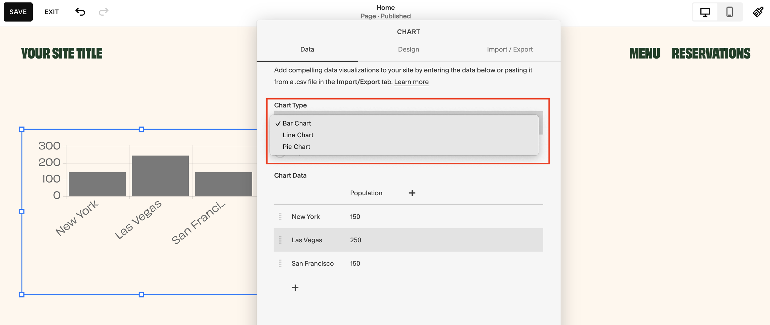
How to Enter Chart Data in Squarespace
Once you've selected your chart type, head to the Data tab within the chart settings.
Setting Up Your Axes
You'll have the option to flip the X and Y axes depending on how you want the data oriented. This is particularly useful for horizontal bar charts or when your category labels are long.
Adding Data Points
Enter your data directly into the fields provided.
As you type in values, the chart updates in real time, so you can see exactly how it looks as you go. There's no need to save and preview separately.
Adding Multiple Data Series
One of the most useful features is the ability to add multiple data series to a single chart. For instance, you could layer in a second row of data, such as "Average Deal Size (£)" alongside "Market Size", to create a richer, more informative visualisation.
When you add a second data series to a bar chart, Squarespace will automatically group the bars by category, making comparisons intuitive at a glance.
Tips for Getting the Most Out of Squarespace Charts
Keep it simple. Charts work best when they communicate one clear message. Avoid cramming too many data series into a single chart.
Label everything clearly. Use your title, axis labels, and legend to ensure visitors understand what they're looking at without needing additional explanation.
Match your palette to your branding. A greyscale chart on a bold, colourful site can look out of place. Take a moment to choose a palette that feels consistent.
Use captions for credibility. If your data comes from a research report or third-party source, cite it in the caption. This builds trust with your audience.
Test on mobile. Squarespace charts are responsive, but always preview how your chart looks on smaller screens to ensure the data remains readable.
When to Use a Chart on Your Squarespace Site
Charts aren't just for data-heavy businesses. Here are a few practical use cases:
Agencies and consultants - Show market size data or industry comparisons to support your positioning.
Financial services - Display performance data, portfolio breakdowns, or pricing comparisons.
Non-profits - Illustrate impact metrics or fundraising progress.
E-commerce brands - Highlight product comparisons or survey results.
Bloggers and content creators - Visualise research findings to add authority to your posts.
Frequently Asked Questions
Can I add multiple charts to one Squarespace page?
Yes. You can add as many chart blocks as you like to a single page. Each one is managed independently.
Are Squarespace charts interactive?
Yes. Visitors can hover over chart elements to see the specific values, making them more engaging than static images.
Can I export chart data from Squarespace?
Not directly from the chart block. Your data lives within the block settings, so keep a copy of your source data in a spreadsheet as a backup.
Does the chart block work on all Squarespace templates?
The chart block is available across all current Squarespace templates that support the block editor (Squarespace 7.1 and later versions of 7.0).
Final Thoughts
The Squarespace chart block is one of those hidden gems that can genuinely elevate the way you present information on your site. It's quick to set up, requires no coding, and produces clean, interactive results straight out of the box.
If you've been looking for a way to make your data more compelling without leaving Squarespace, this is it.