


The New Rules of Web Design for 2026 (And Why Most Sites Are Already Outdated)
Here's an uncomfortable truth: most websites are outdated. Not just the ones that look like they were built in the nineties, but sites built last year, last month, or even last week. Because the rules of web design are changing faster than ever, and if you're not keeping up, you're not just falling behind. You're becoming invisible.
This guide breaks down the five new rules of web design for 2026 - the principles that separate the websites that get noticed from the ones that get ignored. By the end, you'll know exactly what's changing, why it matters, and how to build a site that doesn't just look good, but actually works for your business.
Why the Old Rules No Longer Work
For years, the gold standard of web design was simple: clean layouts, sharp lines, and a minimal aesthetic. If your site looked professional, you were winning.
But in 2026, that's no longer enough.
A website that only looks professional is like a salesperson in an expensive suit with nothing interesting to say. If you are in the Chicago metro, our Joliet website designer team can help you build something worth noticing. Technically impressive, but completely forgettable. And in a world where every business has a website, forgettable is the last thing you can afford to be.
The old rules were about fitting in. The new rules are about standing out.
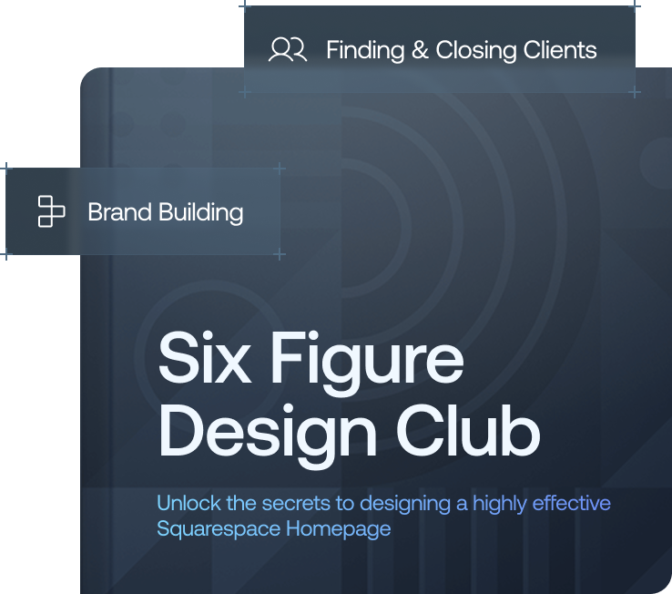
Want a framework for designing the perfect homepage?

Need an expert to build your Squarespace website?
Book a free kick-off call with our team to discuss your project requirements in detail.
Rule 1: Your Website Needs a Personality
The most successful websites of 2026 have a distinct personality. They're bold, different, and not afraid to be a little unexpected.
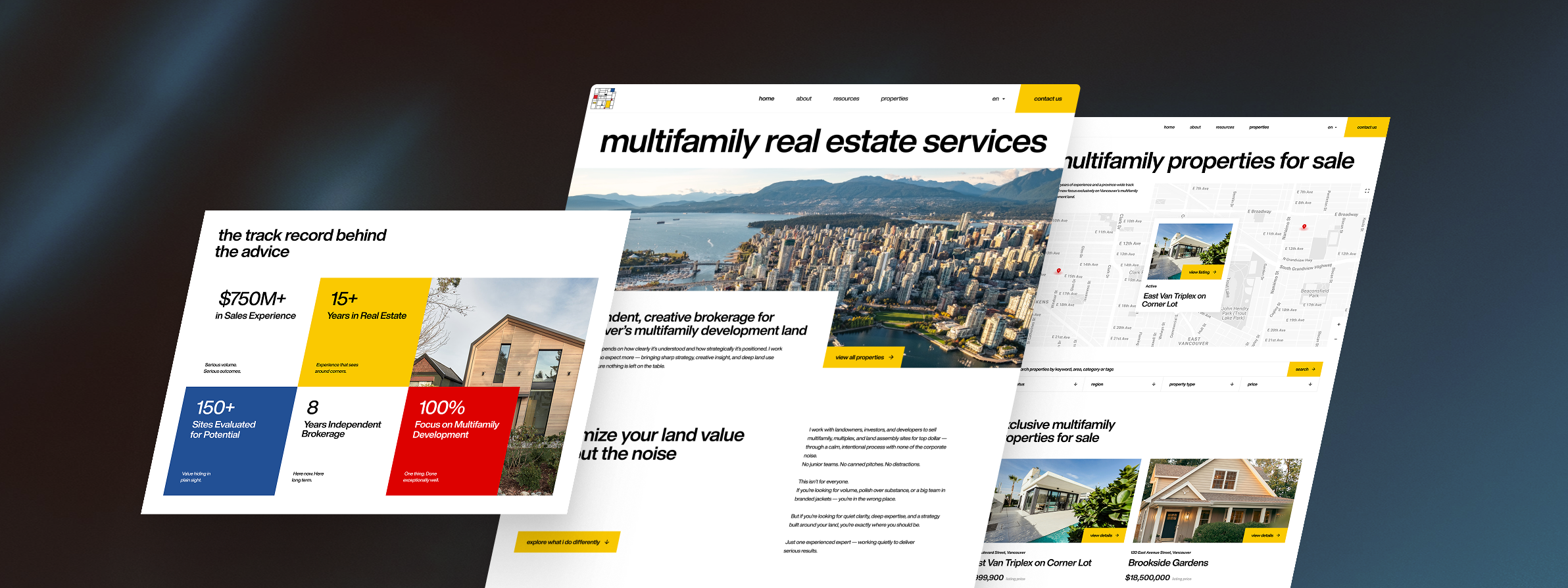
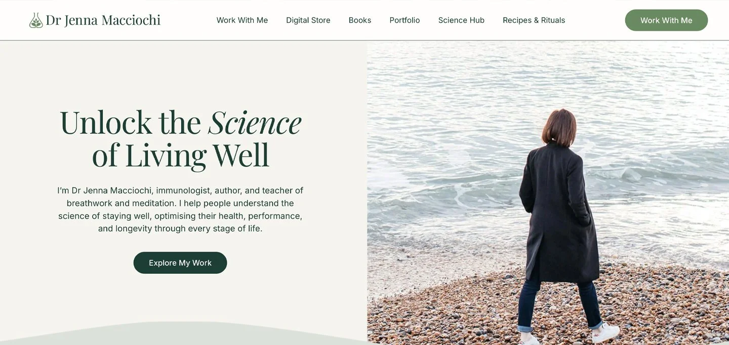
This is driving the rise of what designers are calling tactile maximalism, a direct reaction to years of sterile minimalism. Think rich textures, vibrant colour palettes, and layouts that feel more like a curated magazine spread than a corporate webpage. It's about crafting an experience that's genuinely memorable rather than merely presentable.
Your website shouldn't feel like a brochure. It should feel like a conversation. And the first step to having a conversation is having something to say.
What this means for you: Audit your existing site. Does it reflect your brand's actual voice and values? Or does it look like it could belong to any business in your industry? If you can't tell the difference, your visitors can't either.
Rule 2: Motion With Intention
Animation is nothing new in web design, but for a long time, it was more gimmick than feature. Things would fly in from the side, bounce around the screen, and generally distract from the content rather than support it.
In 2026, the new standard is motion with intention. Subtle animations and micro-interactions that guide users, provide real-time feedback, and make the experience feel more intuitive. When you hover over a button, it should respond. When you scroll, content should appear in a way that feels natural, not theatrical.
The goal isn't to show off technical skill. It's to create a website that feels alive and responsive without overwhelming the person using it. The difference between a static, lifeless page and a dynamic, engaging experience often comes down to these small, purposeful moments of motion.
What this means for you: Review every animation on your site. Does each one serve a purpose, guiding attention, confirming an action, or improving clarity? If it's just decorative, consider removing it.
Rule 3: AI Is Your Copilot, Not Your Replacement
There's been a lot of noise about AI replacing web designers. It won't. But it will absolutely change what the job looks like.
In 2026, the best designers are using AI as a copilot, a tool that handles repetitive, time-consuming tasks so they can focus on the work that requires genuine human judgement. AI can generate colour palettes and font pairings in seconds, write and optimise code, flag accessibility issues, and automate the kind of tedious groundwork that used to eat up hours of a project.
What it can't do is understand your client's brand at a human level. It can't read the nuance in a brief, build a relationship with an audience, or make the kinds of creative calls that turn a good website into a great one. That remains the irreplaceable human element.
What this means for you: Stop thinking of AI as a threat and start treating it as a tool. Identify the tasks in your workflow that are repetitive and low-judgement, those are the ones to automate first. The time you save can go into the work that actually requires you.
Rule 4: Accessibility Is Non-Negotiable
For too long, accessibility has been treated as an afterthought, a checklist to tick off at the end of a project, if it gets done at all. In 2026, that approach is no longer acceptable.
Accessibility isn't a box to check. It's a fundamental part of good design. A website that isn't accessible to everyone is a website that's failing at its most basic job.
The good news is that accessible design and good design overlap more than most people realise. High-contrast colour schemes, clear and readable typography, and proper heading structures don't just help users with disabilities, they make your site easier and more pleasant to use for everyone.
And beyond the user experience argument, there's a growing legal and reputational case for getting this right from the start rather than retrofitting it later.
What this means for you: Build accessibility into your process from day one, not as a final QA step. Use tools like WAVE or Axe during the design and development phase to catch issues early, when they're far cheaper to fix.
Rule 5: The Future Is Fluid
The days of designing for a single screen size are long gone. In 2026, your website needs to look and work brilliantly on every device, from a smartwatch to a widescreen desktop monitor.
But this goes further than responsive design. The next frontier is hyper-personalisation, websites that adapt not just to screen size, but to the individual user's context. Imagine a site that shows different content to a first-time visitor than it does to a returning customer, or one that adjusts its layout based on the user's location or time of day. That level of dynamic, personalised experience is where the web is heading.
This isn't the be-all and end-all it's an evolving space and not every business needs to implement it right now. But it's worth experimenting with, even in small ways, to understand what's possible and what resonates with your audience.
What this means for you: Start by auditing how your site performs across devices. Then consider small personalisation wins, like adjusting a homepage headline based on the traffic source, before moving into more complex implementations.
Putting It All Together
The five rules of web design for 2026 aren't about chasing trends for the sake of it. They're about building something that genuinely serves the people who visit your site, and by extension, your business.
To recap:
Personality - Stand out by having a distinct voice and visual identity.
Motion with intention - Use animation to guide and engage, not to impress.
AI as a copilot - Automate the repetitive, protect the human.
Accessibility from the start - Design inclusively, for everyone.
Fluid, personalised experiences - Think beyond screen size to individual context.
A site that applies these principles won't just look current. It'll work harder, convert better, and leave a stronger impression on every person who lands on it.