


26 Website Design Lessons From Building 750 Websites (That Actually Convert)
After designing hundreds of websites, patterns start to emerge. Some design choices consistently increase conversions and revenue. Others quietly sabotage them.
After 750 website builds, the lessons are no longer opinions, they’re predictable outcomes.
In this article, I’m sharing the 26 most valuable lessons I’ve learned about website design and conversion optimization, so you can build a website that doesn’t just look good, but actually makes money.
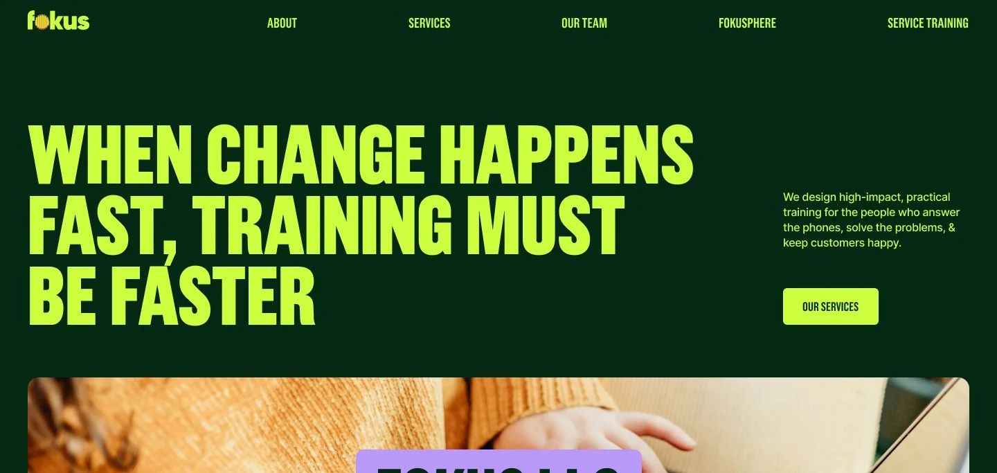
1. Your Hero Section Decides Everything
Most visitors never scroll past your hero section.
If you don’t immediately grab attention and give people a clear reason to stay, they’re gone. Your hero section should include:
Your value proposition
Your clearest call to action
Your most compelling message
Don’t save the good stuff for later. Put it front and centre.
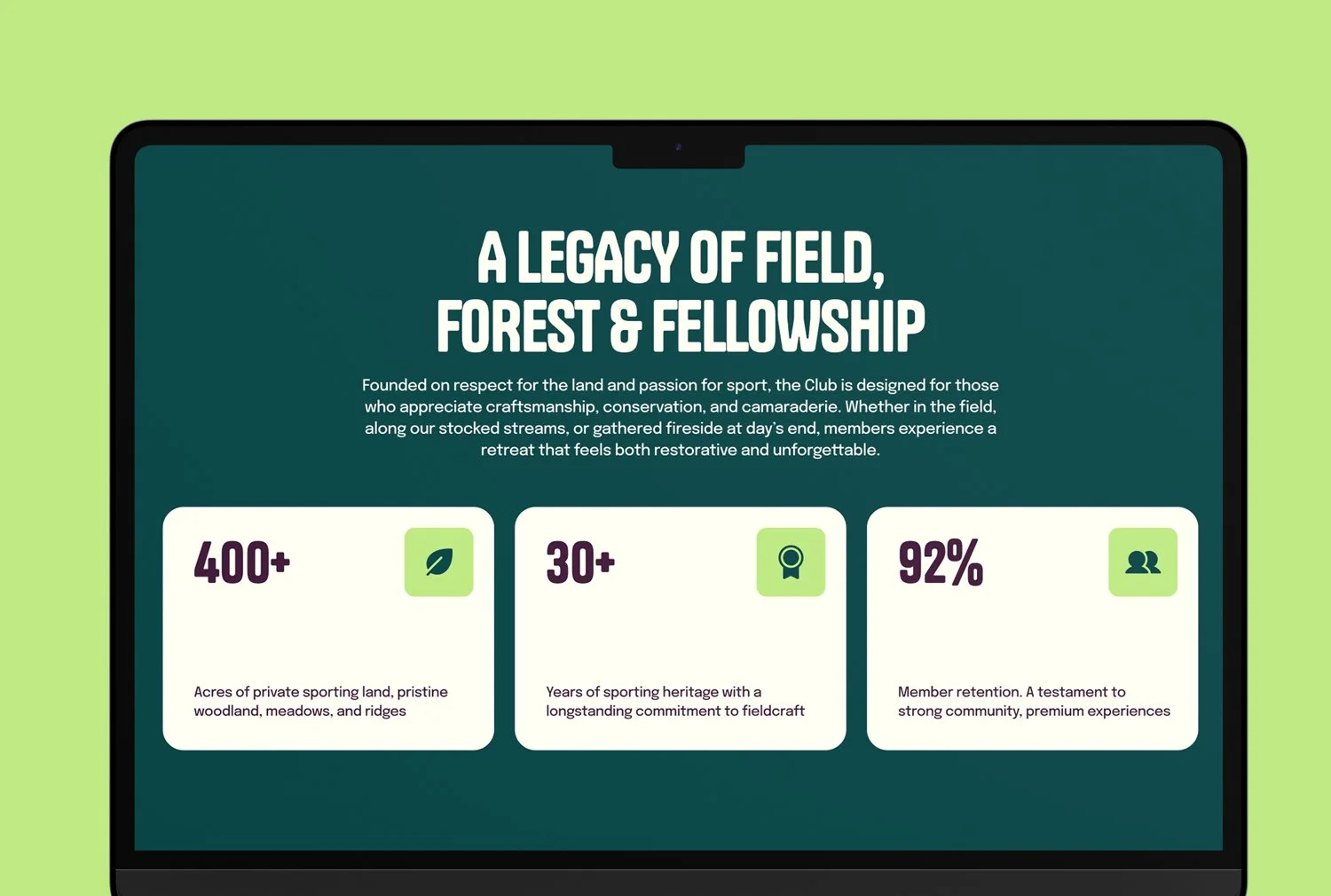
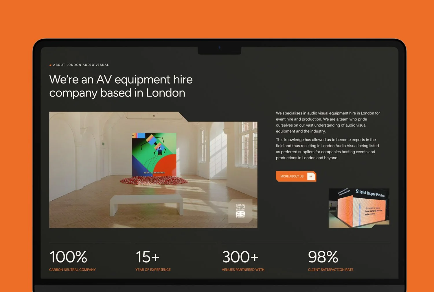
2. Social Proof Is Everything
People don’t trust what you say about yourself, they trust what others say about you.
Testimonials, reviews, client logos, and case studies are powerful trust signals. Don’t sprinkle them in as an afterthought. Make social proof a core part of your website’s structure and let your customers do the selling for you.
3. Your Website Is for Distracted Strangers
Your website isn’t for you, your team, or your mum.
It’s for a distracted stranger with 20 tabs open and dinner on their mind. They need to know:
What you do
Who you do it for
Why they should care
And they need to know it fast.
4. Case Studies Beat Testimonials Every Time
Testimonials are quotes.
Case studies are stories.
A strong case study walks visitors through:
The problem
The solution
The result
Stories create belief and belief drives conversions.
5. You Have Less Than 3 Seconds
We live in the attention economy.
Your headline, hero image, and opening sentence must instantly communicate why you’re the best choice. If visitors can’t understand your value in seconds, you’ve already lost them.
6. White Space Is a Design Weapon
White space isn’t empty space.
It improves readability, reduces cognitive load, and guides the user’s eye to what matters most. Filling every pixel usually hurts conversions, not helps them.
7. Headlines Do 80% of the Selling
If your headlines don’t work on their own, your body copy won’t save them.
Every headline should act like a mini advertisement that clearly communicates a benefit. Spend more time on headlines than almost anything else.
8. If You Look Like Everyone Else, You’ll Be Priced Like Everyone Else
Your website is your biggest chance to differentiate.
Show your:
Personality
Process
Point of view
Unique value
Blending in is expensive.
9. Most Websites Say Too Much
Visitors don’t leave because you didn’t say enough, they leave because you said too much.
Walls of text and overcomplicated navigation overwhelm users. Ruthlessly edit your content and focus on clarity over completeness.
10. Every Section Should Answer a Question or Objection
The less you talk about yourself and the more you address your visitor’s fears, objections, and problems, the better your site will perform.
Think of your website as a conversation, not a brochure.
Want a framework for designing the perfect homepage?

Need an expert to build your Squarespace website?
Book a free kick-off call with our team to discuss your project requirements in detail.
11. Over-Animation Kills Conversions
Excessive animation impresses designers, not customers.
Too much movement:
Slows your site
Distracts users
Creates friction
Use subtle animation sparingly and always in service of clarity.
12. You’re an Expert - Your Visitors Aren’t
What’s obvious to you is confusing to first-time visitors.
Avoid jargon, acronyms, and internal language. Explain what you do in the simplest possible terms. A great test: show your copy to someone outside your industry. If they’re confused, your customers will be too.
13. Pretty Websites Don’t Convert - Clear Ones Do
Design should never compete with clarity.
Your website’s job is to communicate value and guide action. If the design gets in the way of that, it’s failing, no matter how good it looks.
14. If You Don’t Control the Narrative, Users Will
And the story they invent is rarely the one you want.
Guide visitors clearly from problem to solution. Leave no room for confusion or misinterpretation.
15. Too Many Choices = No Choice
Analysis paralysis is real.
Multiple calls to action and endless options reduce conversions. Guide visitors to one primary decision and make it easy to take.
16. You Probably Don’t Have Enough Calls to Action
One CTA at the top and one in the footer isn’t enough.
Every section should offer a clear next step. As soon as someone is convinced, they should be able to act immediately.
17. Corporate Jargon Kills Trust
Buzzwords don’t make you sound smart, they make you sound generic.
Phrases like:
“Synergistic solutions”
“Leveraging paradigms”
“Mission-critical infrastructure”
Destroy trust. Plain language wins every time.
18. Consistency Beats Cleverness
A boring but consistent system will outperform a clever but chaotic one.
Consistency builds trust and makes your site easier to use. Follow proven design and sales principles instead of reinventing the wheel on every page.
19. Your Website Should Repel the Wrong People
Great websites don’t try to appeal to everyone.
Be clear about:
Who you work with
Who you don’t
What you charge
What you stand for
Filtering out bad-fit clients early saves time, money, and frustration.
20. Stock Photos Aren’t Evil, Bad Ones Are
Generic stock photos kill credibility instantly.
If you use stock imagery, make sure it’s:
Authentic
High quality
Relevant
Better yet, invest in professional photography.
21. Mobile Isn’t Optional - It’s the Default
Your mobile site isn’t a “version” of your website.
For most visitors, it is your website. Design mobile-first or risk delivering a broken experience to the majority of your audience.
22. Your Website Is a 24/7 Salesperson
Your website works nonstop, across all time zones.
Is it equipped to sell?
Clear messaging
Strong CTAs
Simple buying process
Treat it like a revenue machine, and it will become one.
23. Most Websites Need Fewer Pages, Not More
Every page is another decision.
Instead of adding more pages, consolidate your content into fewer, stronger, higher-impact pages that clearly guide visitors.
24. Launching Isn’t the Finish Line
It’s the starting point.
After launch, you should:
Analyse behaviour
Run A/B tests
Optimise for conversions
Improve content
Your website should evolve continuously.
25. SEO and Design Work Better Together
Good SEO and good design aren’t enemies.
Clear structure, great content, and easy navigation are good for users, and what’s good for users is good for Google.
26. People Don’t Buy Websites - They Buy Outcomes
Nobody wants a website.
They want:
More leads
More sales
More authority
Stop selling features. Sell results.
Final Thoughts
A high-converting website isn’t about trends or tricks. It’s about clarity, trust, and guiding people to the right decision.
Apply these 26 principles, and your website won’t just look better, it’ll perform better.