


Resize Images for Mobile on Squarespace
One of the biggest mistakes Squarespace users make is forgetting to check how their website looks on mobile. With most visitors browsing from their phones, a messy mobile layout can seriously harm user experience and cost you potential customers.
Images are one of the most common culprits. Even if everything looks clean and perfectly aligned on desktop, mobile layouts can easily break:
Images can become misaligned,
The sizing may change unpredictably,
Content may overlap,
Entire images can get cut off.
The good news? Fixing this is simple once you know how. In this guide, I’ll walk you through how to properly adjust and align images on mobile in Squarespace using Fluid Engine.
Why Mobile Image Layouts Matter
A well-structured mobile layout isn’t just about aesthetics it directly impacts:
Conversion rates
Bounce rates
Readability
Professionalism and trust
If your website looks sloppy on mobile, visitors won’t stick around long enough to become customers.

Want a framework for designing the perfect homepage?

Need an expert to build your Squarespace website?
Book a free kick-off call with our team to discuss your project requirements in detail.
Step 1: Compare Your Desktop and Mobile Layouts
Start by opening your page in the Squarespace editor.
On desktop, everything may look perfect, images aligned, spacing consistent, no weird gaps.
But once you switch to mobile view, problems often appear:
Images get pushed around
Spacing collapses
Single images sit awkwardly on their own
Important areas of an image get cut off
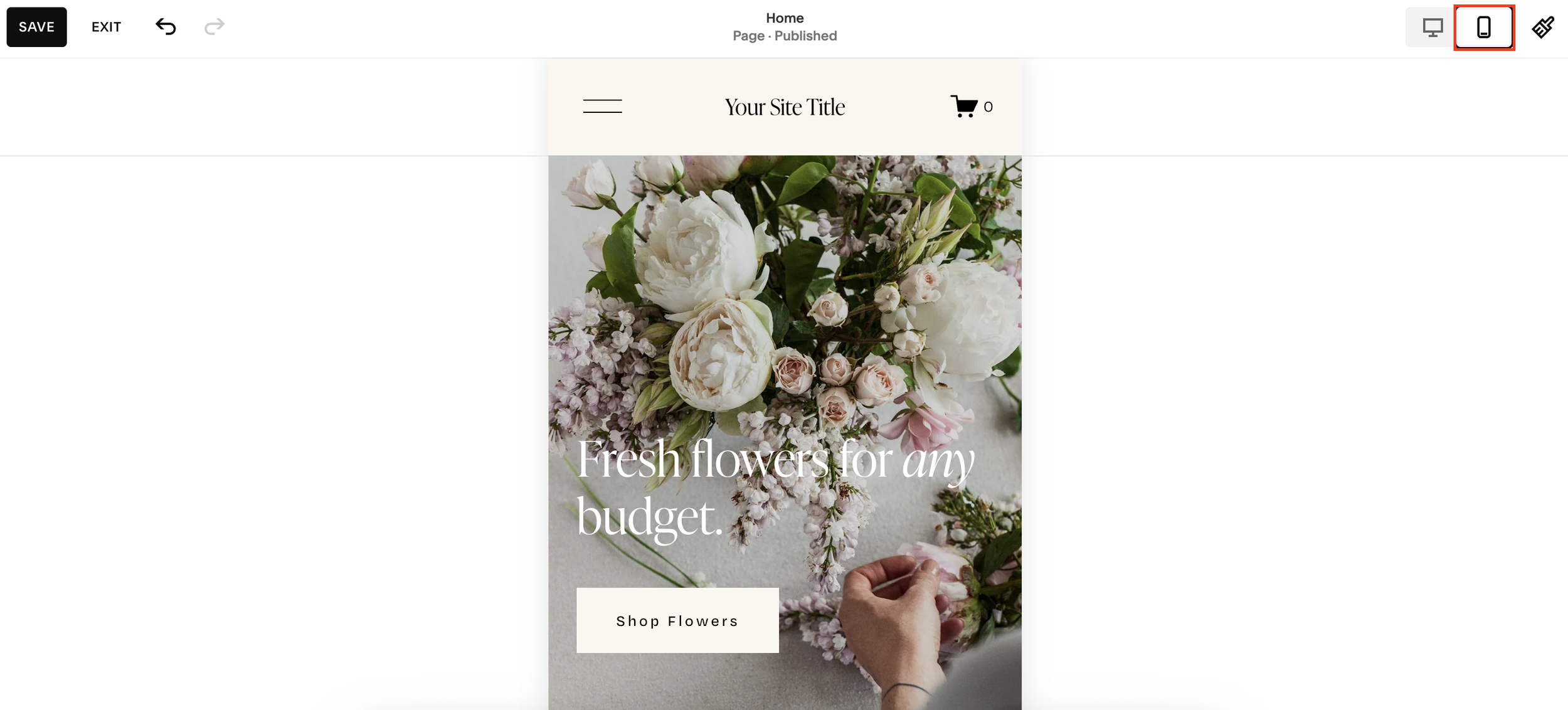
Step 2: Enter Mobile Editing Mode
In the editor, click the mobile icon to switch to mobile view.
Squarespace Fluid Engine allows you to completely customize your mobile layout separately from desktop and that’s exactly what makes it so powerful.
Step 3: Resize and Reorganise Your Images
With mobile mode active, begin adjusting your images:
• Drag images up or down to realign the layout - Pull images so they sit in a logical sequence and nothing gets cropped.
• Resize images by dragging the edges - Make sure the important parts of each image are fully visible.
• Rebuild the grid if needed - Fluid Engine allows you to create new row and column structures just for mobile.
• Adjust multiple images together - Select two images and resize them at the same time. When the yellow alignment indicators appear, you know:
the widths match
the heights match
everything aligns perfectly
This ensures your mobile grid looks intentional and professional.
Step 4: Align the Text With Your Updated Layout
If any text becomes misaligned after adjusting your images, simply drag it up into the correct position. Double-click to expand the text block if needed.
Your goal is to create a clean, intuitive visual flow that mirrors the intent of your desktop layout, even if the structure is different.
Step 5: Save Your Updated Mobile Layout
Once everything looks polished:
Click Save
Click Exit
Your new mobile layout will now look just as cohesive and professional as your desktop design.
Final Thoughts
A great mobile experience is essential for any modern Squarespace website. By taking a few minutes to realign your images and rebuild your mobile layout, you ensure your site looks clean, intentional, and trustworthy across all devices.