


What Makes a Website Look Premium (And Why Most Websites Feel Cheap)
Most websites don’t look bad but they feel cheap.
And that’s a problem.
Within seconds of landing on your site, visitors subconsciously decide whether your business feels professional, trustworthy, and worth their time. If your website feels cheap, that judgment is almost always negative, and once it’s made, it’s incredibly hard to undo.
After working with multiple Fortune 500 companies and helping generate over $10 million in incremental revenue, clear patterns emerge. There are specific elements that separate websites people want to buy from and websites people leave immediately.
In this guide, you’ll learn:
What actually makes a website feel premium
Why most websites fail even if they “look fine”
Exactly what to focus on when building or redesigning your site
Why Most Websites Fall Short
Most websites fall into one of two categories.
1. The “Locked-In” Website
These businesses hired a developer years ago and are now completely dependent on them.
Want to change a single line of text on the homepage? You’ll have to:
Submit a support ticket
Wait one or two weeks
Possibly pay extra on top of an existing retainer
There’s zero autonomy, constant friction, and growing frustration inside the business.
2. The DIY or Cheap Website
On the other end, you’ve got businesses that built the site themselves or hired someone inexpensive.
Budget constraints are real, but here’s the issue:
No strategy behind the site
Confusing sitemap and page structure
No SEO or UX considerations
No clear call to action
These websites aren’t doing even a fraction of what they could be doing for the business.
If most websites were rated on a scale of 0 - 10, the majority would sit around a 2, not because they’re broken, but because they make visitors think: “These people don’t look professional.”
And that perception sticks.
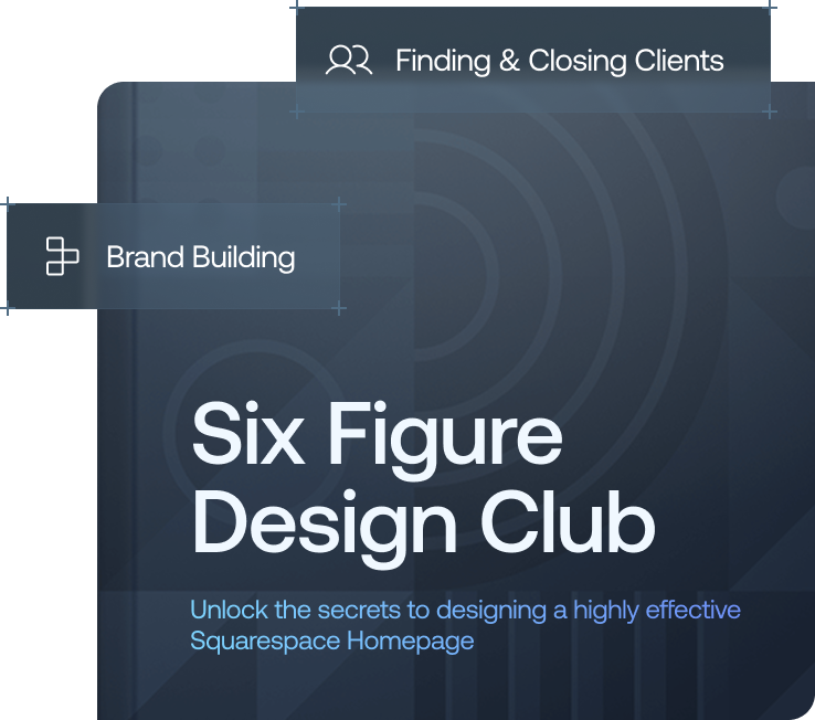
Want a framework for designing the perfect homepage?

Need an expert to build your Squarespace website?
Book a free kick-off call with our team to discuss your project requirements in detail.
The #1 Thing That Makes a Website Feel Premium: Bespoke Assets
Most cheap websites rely on:
Plain text on blank backgrounds
Generic stock photos
Free icons everyone has seen before
Premium websites don’t.
They use bespoke, custom-designed assets and graphics created specifically for the brand.
When done correctly, custom graphics:
Add depth and visual interest
Break up large blocks of content
Guide the visitor’s eye
Make information easier to digest
But there’s a catch.
If a graphic feels out of place, wrong style, wrong tone, wrong energy, it’s worse than having no graphic at all. Premium assets must belong to the brand.
When they do, the difference is dramatic. Visitors stop skimming. They start reading.
Brand Guidelines: The Foundation of a Premium Website
A premium website always starts with strong brand foundations.
1. Your Logo
A professional logo doesn’t need to be complex but it must be intentional.
If your logo looks like it was made in Canva in 15 minutes, people will feel it instantly.
2. Your Color Palette
This is where many websites go wrong.
Choosing five colours that “look nice” individually isn’t enough. A premium colour palette:
Is cohesive
Creates a consistent mood
Reinforces brand identity across the site
Random colours create visual noise. Intentional colours create trust.
3. Your Fonts
Fonts have an enormous impact on perceived quality.
Childish fonts
Outdated fonts
Hard-to-read fonts
Any of these will instantly make a site feel cheap.
The right fonts, however, can make a brand feel more sophisticated, sometimes even more premium than the business itself.
Premium is about details. When visitors feel that care has gone into the small things, trust follows.
Subtle Animation (Not Flashy Distractions)
Premium websites use subtle animation, not gimmicks.
Bad animation:
Bouncing elements
Spinning graphics
Distracting motion everywhere
This overwhelms users and does the opposite of what you want.
Good animation:
Elements gently fade in as users scroll
Buttons respond naturally on hover
Sections move in a way that guides attention
The site feels alive, not chaotic.
Well-designed animation reduces confusion, prevents “rage clicking,” and quietly guides users through the experience, even if they don’t consciously notice it.
Website Structure: Where Premium Sites Are Won or Lost
This is where many visually impressive websites fail.
A cheap site may have decent individual pages, but:
The journey isn’t clear
The sitemap doesn’t make sense
Visitors don’t know what to do next
Premium websites are intentional.
Every page has a purpose. Every page leads somewhere. The call to action is clear, visible, and easy to take.
This isn’t just about conversions, it’s also critical for SEO.
Search engines reward:
Logical page hierarchy
Clear internal linking
Structured, user-friendly layouts
These elements aren’t flashy, but they’re the difference between a website that looks nice and one that delivers serious ROI.
Premium Websites Empower the Client
One of the biggest differences between premium and cheap websites isn’t how they look, it’s how they’re built.
Premium websites:
Are owned by the client
Can be updated without a developer
Allow easy content changes and growth
Cheap websites often trap clients in a “black box” where every small update requires outside help.
That’s not premium, it’s a liability.
When clients can update their site themselves, they do:
Content stays fresh
Services evolve
Case studies get added
The site feels alive
And visitors can feel that freshness immediately.
Proper Handover & Post-Launch Support
A premium website experience doesn’t end at launch.
Cheap services:
Hand over the site
Disappear
Premium services:
Provide full training
Walk clients through updates and features
Set clear expectations
Offer post-launch support
For example:
Recorded or live training sessions
30 days of free email support post-launch
Optional ongoing maintenance and concierge support
Premium isn’t just the product, it’s the entire experience, from first call to months after launch.
Final Thoughts: What “Premium” Really Means
A premium website isn’t defined by one feature.
It’s the combination of:
Bespoke visuals
Strong brand foundations
Thoughtful typography
Subtle animation
Clear structure and CTAs
SEO-friendly architecture
Client empowerment
Ongoing care and support
When all of these elements come together, visitors don’t just see quality, they feel it.
And that feeling is what turns browsers into buyers.