


Design a Mobile-Friendly Menu on Squarespace
When it comes to Squarespace mobile optimisation, most users focus heavily on how their site looks on desktop. The desktop version looks great, so mobile often gets overlooked. But in reality, the majority of users will experience your website on a phone, and small design decisions can have a big impact.
One area that doesn’t get talked about enough is the Squarespace mobile menu. It’s hard to get wrong, but there are a few simple tweaks that can significantly improve usability and user experience.
In this guide, I’ll walk you through how to optimise your Squarespace mobile menu, and share a few practical UX tips you can apply immediately.
Why Mobile Menu Optimisation Matters on Squarespace
Your mobile menu is one of the most frequently used elements on your site. If it’s awkward to reach or confusing to use, visitors are more likely to:
Leave your site quickly
Miss key pages
Struggle to navigate your content
Even small improvements, like menu positioning and alignment, can make your mobile site feel more polished and intuitive.

Want a framework for designing the perfect homepage?

Need an expert to build your Squarespace website?
Book a free kick-off call with our team to discuss your project requirements in detail.
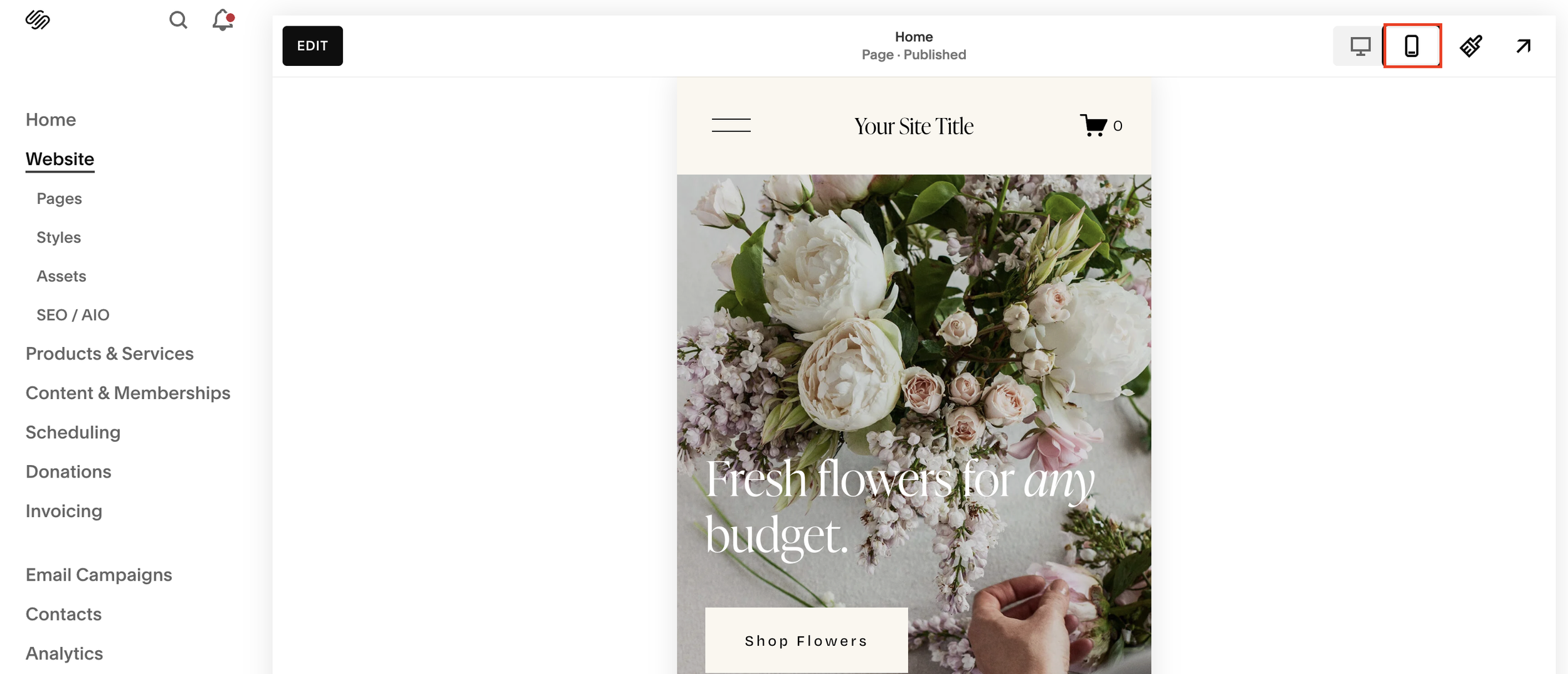
How to Access the Mobile Menu Editor in Squarespace
To edit your mobile menu:
Open your Squarespace site editor
Click Mobile at the top of the screen
Select Edit
This switches your view to mobile layout mode, allowing you to adjust mobile-specific elements.
Positioning the Hamburger Menu for Better Thumb Reach
Should the Hamburger Menu Be on the Right or Left?
A UX principle I learned early on, and still find useful, is that the hamburger menu is often best placed on the right-hand side of the screen.
Why?
Most users are right-handed
The right thumb naturally drifts toward the top-right corner
It’s easier to reach without stretching
Of course, this isn’t universal, left-handed users may prefer the opposite, but designing for the majority often improves overall usability.
How to Move the Hamburger Menu in Squarespace
To reposition the hamburger menu:
Click Edit Site Header
Go to Design
Select Layout
Choose a layout that places the hamburger icon on the right
Squarespace offers multiple header layouts, so you can:
Separate the menu from the cart icon
Reduce accidental taps
Improve clarity and spacing
This is especially useful for e-commerce sites where users might accidentally tap the cart instead of the menu.
Optimising Mobile Menu Item Alignment
Once your hamburger menu is positioned correctly, the next step is to adjust how the menu items appear.
Menu Alignment Options
In the Menu settings, you can choose to align navigation links:
Left
Center
Right
Best Practice: Centered Menu Items
While alignment is largely personal preference, centered menu items tend to work best for mobile because:
They’re easier to reach for both right- and left-handed users
They feel more balanced visually
They reduce thumb travel distance
Spacing items slightly also helps prevent mis-taps and improves readability.
Mobile Menu Design Is About Preference With Intention
Unlike some mobile optimisation techniques, mobile menu design isn’t purely rule-based. A lot of it comes down to:
Your audience
Your content structure
Your brand style
However, being intentional, rather than leaving defaults untouched, can dramatically improve the mobile experience.
Sometimes, it’s the smallest tweaks that make a site feel professionally designed.
Final Thoughts on Squarespace Mobile Menu Optimisation
Optimising your Squarespace mobile menu doesn’t require custom code or advanced design skills. With just a few adjustments, you can:
Improve thumb reach and navigation
Reduce user friction
Create a more intuitive mobile experience
If you’re already spending time refining your mobile layouts, don’t forget to give the mobile menu the same attention, it’s one of the most used features on your site.