


Customize Hamburger Menu on Squarespace
Want to change the look of the hamburger menu icon on your Squarespace website’s mobile version?
Good news, it’s incredibly simple, and you don’t need any custom code.
In this quick guide, I’ll show you step-by-step how to update your mobile navigation icon in Squarespace so it matches your site’s style.
Why Change Your Hamburger Menu Icon?
The hamburger icon (those two or three horizontal lines in your mobile navigation) is a small design element but it plays a big role in your site’s user experience.
Updating the style, thickness, and look can:
Better match your brand’s aesthetic
Improve visibility for mobile visitors
Make your navigation stand out

Want a framework for designing the perfect homepage?

Need an expert to build your Squarespace website?
Book a free kick-off call with our team to discuss your project requirements in detail.
Step-by-Step: How to Update Your Mobile Menu Icon in Squarespace
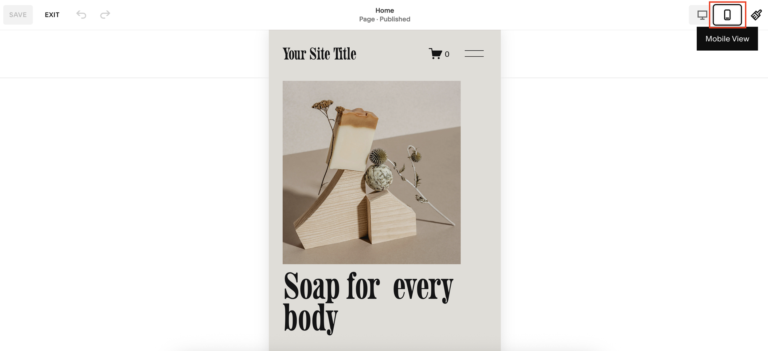
1. Switch to Mobile View
In your Squarespace editor, click the mobile view icon. You’ll now see the default hamburger menu, typically two lines stacked.
2. Enter Header Edit Mode
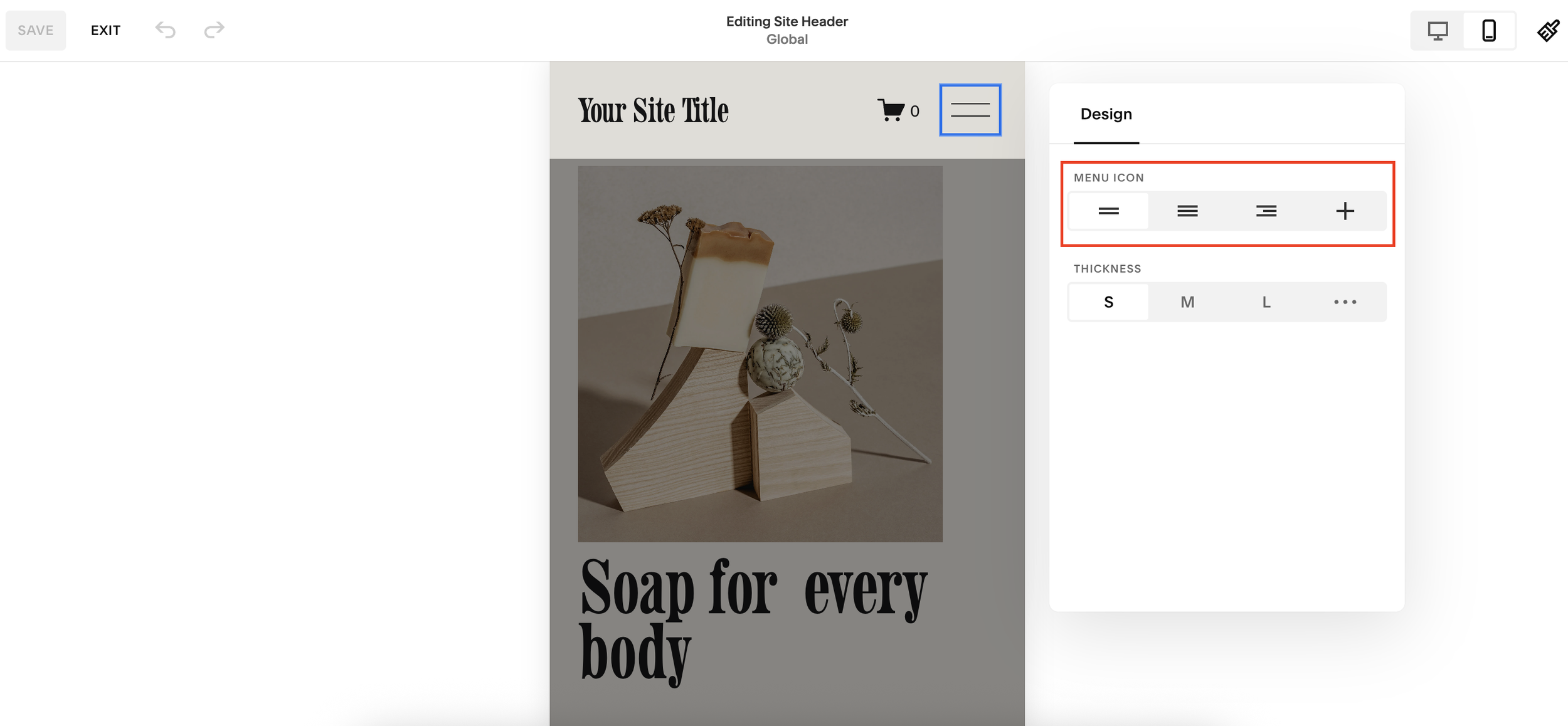
Click Edit, then hover over your site’s header.
Select Edit Site Header.
3. Access Menu Icon Settings
Double-click on the hamburger menu icon. This will open a panel where you can:
Choose between two bars, three bars, two-and-a-half lines with a plus symbol, and more.
Adjust thickness: small, medium, large, or up to 5px if you click the dots for more options.
Tip: Around 2px thickness is a sweet spot for most designs.
4. Pick Your Favourite Icon Style
Select the icon that works best for your brand.
5. Save Your Changes
Once you’ve chosen your style and thickness, simply save your edits. Your new menu icon will now appear in mobile view.
Common Misconceptions
Many people assume you need custom CSS to change the hamburger icon style in Squarespace.
In reality, it’s a built-in feature, no coding required. Just a few clicks in the editor and you’re done.
Final Thoughts
Changing your Squarespace hamburger menu icon is a small tweak that can have a big impact on your site’s mobile design. It’s quick, code-free, and helps create a cohesive look for your brand.