


Fixing Mobile View Issues on Squarespace
One of the most common mistakes Squarespace users make is designing a beautiful desktop website, but forgetting to optimize it for mobile.
The result? A site that looks sleek on desktop but falls apart on smartphones. Text overlaps, images are misaligned, buttons become unclickable, and potential customers leave frustrated.
In today’s world, where more than half of web traffic comes from mobile devices, failing to mobile-optimize your Squarespace site can cost you conversions, customers, and credibility.
In this guide, I’ll show you why mobile optimization matters, how Squarespace handles it, and the step-by-step process to manually adjust your site for mobile perfection.
Why Mobile Optimization on Squarespace Matters
Your Squarespace site might look flawless on desktop, but that’s only half the picture. Visitors who land on a broken, messy mobile site will:
Struggle to navigate your content
Get frustrated with overlapping elements
Abandon your site altogether
A poorly optimized mobile site doesn’t just affect user experience, it also hurts your SEO rankings. Google prioritizes mobile-friendly websites in search results, so if you want to attract traffic, you can’t afford to ignore this step.

Want a framework for designing the perfect homepage?

Need an expert to build your Squarespace website?
Book a free kick-off call with our team to discuss your project requirements in detail.
How to Fix Mobile Layouts in Squarespace
Here’s a simple process you can use to make sure your Squarespace site looks just as good on mobile as it does on desktop.
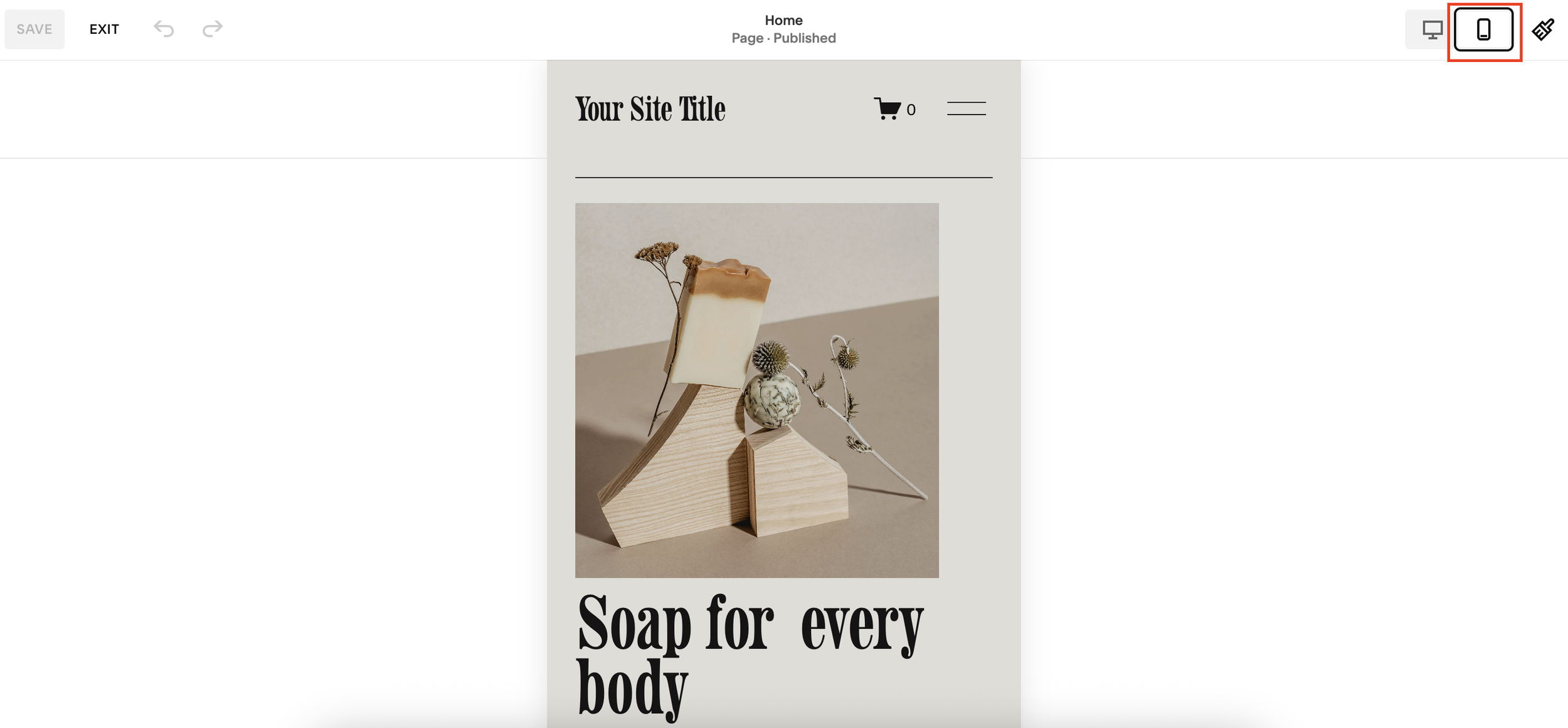
1. Preview Your Site on Mobile
Inside your Squarespace editor, click the mobile preview icon. This lets you see how your site looks on smaller devices before publishing.
2. Check Alignment and Hierarchy
Look for overlapping elements or incorrect order of text and images. For example:
Titles should appear before supporting text.
Images should align with their relevant content.
Spacing should be consistent across sections.
3. Use the Grid for Spacing
Press G in the editor to display Squarespace’s grid system. This helps you keep equal spacing between sections and properly center your content.
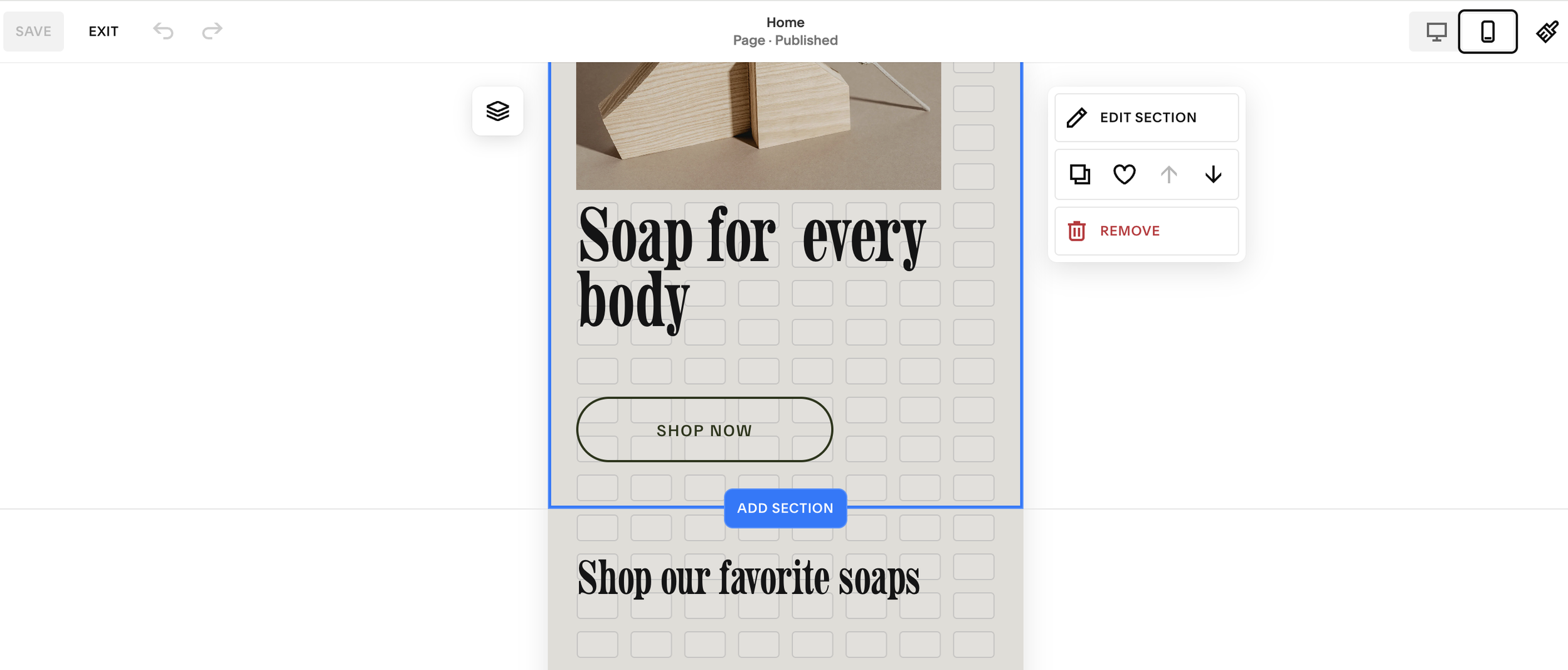
4. Manually Adjust Blocks
Don’t rely solely on Squarespace’s auto-optimization. Move text and image blocks manually to restore the correct hierarchy and flow. Use your arrow keys for precision.
5. Optimize Section by Section
If your design is non-linear (e.g. creative layouts with staggered images and text), expect to spend extra time adjusting each section individually. This ensures your mobile site maintains the same visual impact as your desktop version.
6. Save and Preview Again
Once you’ve made changes, save and check your site in preview mode. Scroll through on mobile to confirm that:
Spacing looks clean
Content order makes sense
Nothing feels cramped or misaligned
Common Mobile Optimization Issues in Squarespace
Squarespace does attempt to auto-optimize your design for mobile, but it doesn’t always get it right. Some common issues include:
Text blocks appearing in the wrong order
Inconsistent spacing between sections
Misaligned images
Overlapping buttons and text
Poor hierarchy that confuses users
That little blue mobile icon in Squarespace is your best friend, it’s a signal that your site needs attention on smaller screens.
Pro Tip: Don’t Rely on Auto-Optimization
Even though Squarespace is improving its mobile handling, no platform can perfectly translate a complex desktop design into a flawless mobile version. Some manual fine-tuning is always required.
Think of mobile design not as an afterthought, but as a core part of your website build.
Final Thoughts
A well-optimized mobile site can be the difference between a visitor bouncing or becoming a customer.
By taking the time to adjust layouts, check spacing, and refine hierarchy in Squarespace, you ensure your site looks professional, polished, and user-friendly across all devices.