


Hide Elements on Mobile on Squarespace [BRAND NEW FEATURE]
If you tuned into Circle Day 2025, you’ll know Squarespace dropped a ton of exciting updates this year. Among all the new design tools coming soon, one standout feature has already launched, Layers.
This new Squarespace Layers feature is a total game-changer for designers and site owners alike. It lets you easily view, organize, and now even hide elements on desktop or mobile, all without using a single line of code.
In this guide, we’ll show you exactly how to use Layers in Squarespace to customize your mobile layout like a pro.
What Are Layers in Squarespace?
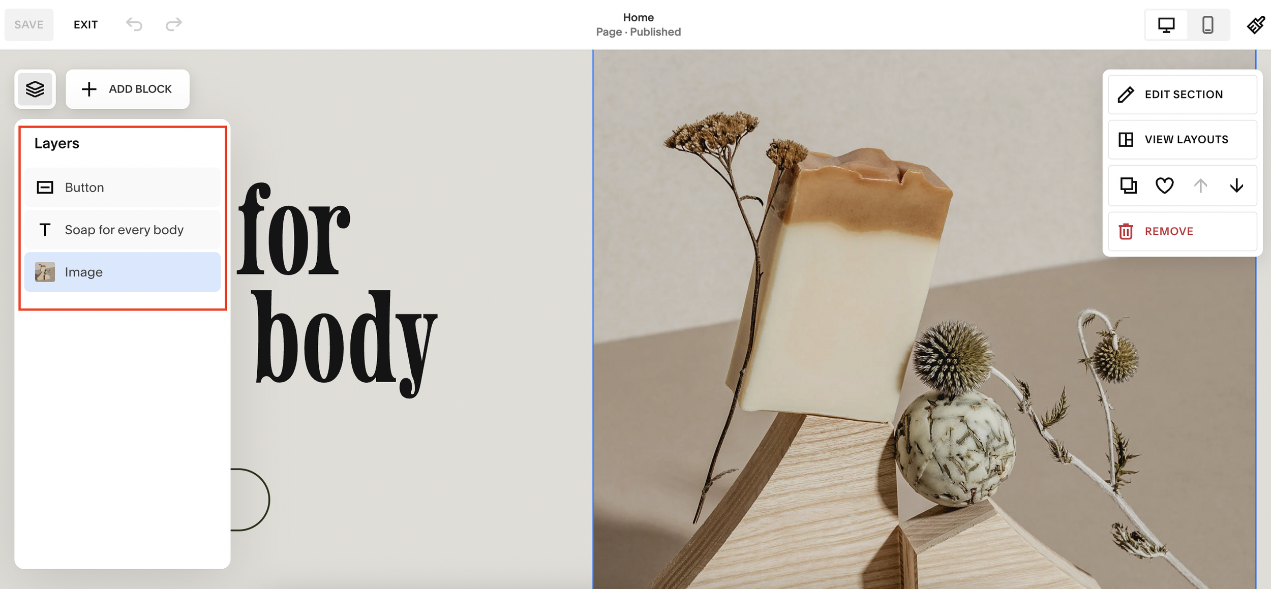
Layers give you a bird’s-eye view of every element within a section of your page, images, buttons, text blocks, and more. Think of it like Photoshop or Figma: you can see all your content “stacked” and edit each element individually.
The Layers icon appears when you hover over a section while editing your page. You can also open it quickly by pressing “L” on your keyboard (just like pressing “G” opens the Grid view).

Want a framework for designing the perfect homepage?

Need an expert to build your Squarespace website?
Book a free kick-off call with our team to discuss your project requirements in detail.
The Best Part: Hide Elements on Desktop or Mobile (No Code!)
Until now, hiding specific content for mobile or desktop views in Squarespace required adding custom CSS, but that’s no longer necessary. With the Layers panel, you can show or hide elements instantly.
Here’s how to do it:
Step 1: Open the Page You Want to Edit
Go to your Pages panel and select the page you’d like to edit, for example, your homepage. Then click Edit.
Step 2: Open the Layers Panel
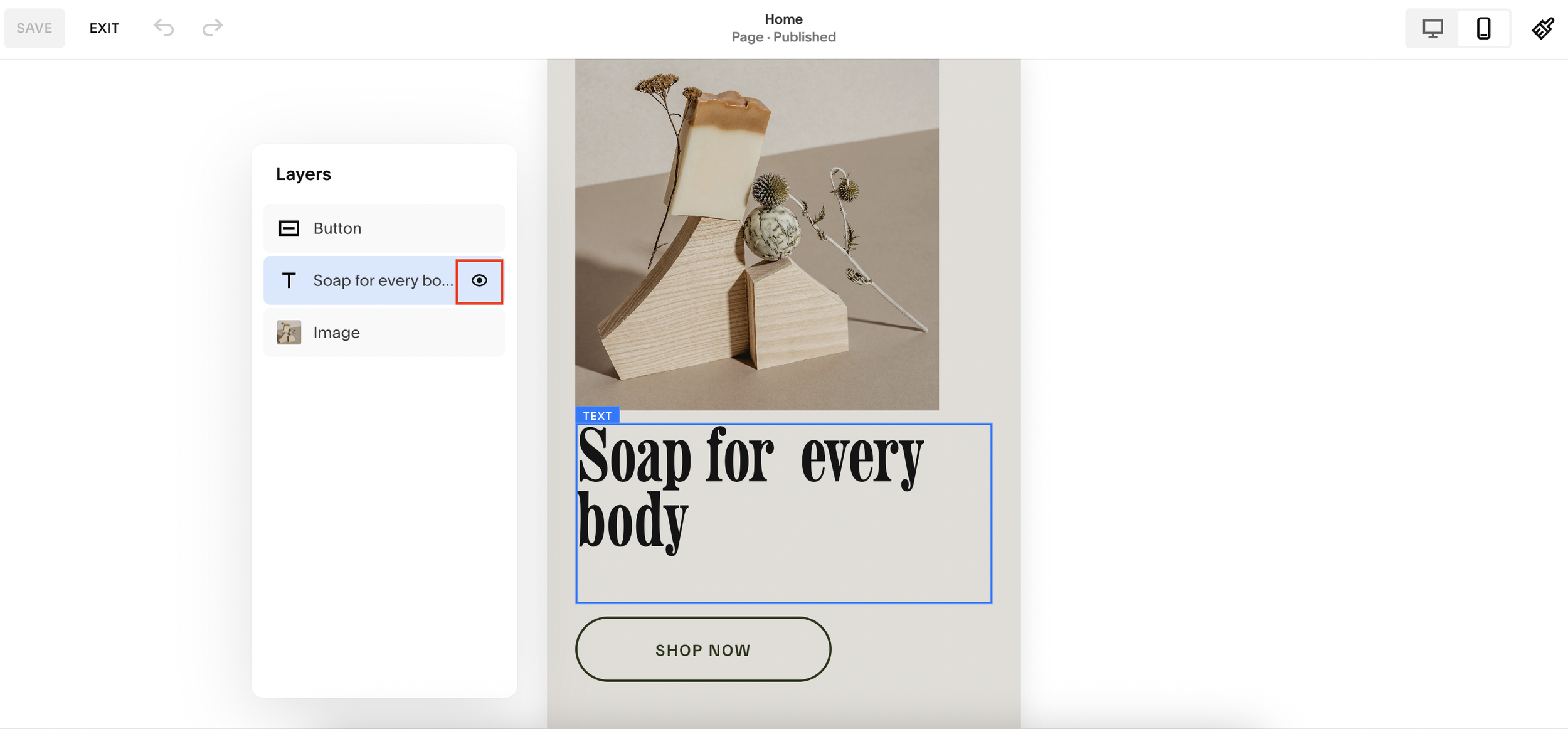
Hover over any section and click the Layers icon. Or simply press L on your keyboard to open it.
You’ll now see a list of all the elements within that section, such as image blocks, text blocks, or buttons.
Step 3: Switch to Mobile View
Switch your editor to mobile view so you can see how your site looks on smaller screens.
Step 4: Hide Elements You Don’t Want on Mobile
Let’s say you don’t like how a specific section (like “Hair Removal”) looks on mobile. Find that element in your Layers panel and click the eye icon to hide it.
That’s it! The section will now disappear on mobile, but stay visible on desktop.
Step 5: Save and Preview
When you’re happy with your edits, click Save. You’ll notice your desktop layout remains untouched, only your mobile version changes.
You can repeat this process for any section: hide an image, adjust a layout, or restyle your page specifically for mobile.
Why the Squarespace Layers Feature Is a Game-Changer
This update completely transforms how designers work within Squarespace. You can now:
Customize layouts for different devices without using code.
Simplify complex designs by visually managing elements.
Adjust sections for better mobile usability and load speed.
It’s faster, cleaner, and much more flexible, giving you creative control like never before.
Final Thoughts
Squarespace’s new Layers tool is a powerful addition that makes responsive design easier than ever. You can finally say goodbye to CSS workarounds and hello to drag-and-drop simplicity.