


The NEW WAY of Web Design in 2026
Most websites today are built completely backwards.
That’s not a criticism of designers or agencies, it’s simply how the industry has operated for years. The traditional approach prioritises visuals first, and strategy later. The result? Websites that often look good but fail to generate results.
In this guide, we’ll break down the modern web design process used in 2026, a strategy-first approach that ensures your website doesn’t just look great, but actually performs.
Why Traditional Web Design Fails
In the old model, the process usually looks like this:
Pick a template
Start designing pages
Make visual decisions (fonts, colours, layout)
Figure out messaging and purpose later
The problem?
By the time strategy is considered, the foundation is already wrong.
This leads to:
Confusing user journeys
Weak conversions
Poor SEO performance
Websites that “look fine” but don’t work
Modern web design flips this entire process.
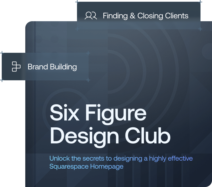
Want a framework for designing the perfect homepage?

Need an expert to build your Squarespace website?
Book a free kick-off call with our team to discuss your project requirements in detail.
Step 1: Strategy Comes First (Always)
Before anything visual is created, you must define strategy.
Ask these key questions:
Who is the website for?
What do they already know when they arrive?
What do you want them to do?
What do they need to understand before they act?
At the core of everything, there should be one clear goal:
What is the single most important action you want a visitor to take?
Examples:
Book a call
Fill in a form
Make a purchase
Sign up
Everything on the site should support that one action.
Without this step, every design decision becomes guesswork, and that’s why so many websites underperform.
Step 2: Build a Clear Site Structure (Site Map First)
Once your strategy is defined, you move to structure.
This is where you create a site map, a simple outline of all your pages and how they connect.
A strong site map:
Creates a logical user journey
Reduces confusion
Supports conversions
Improves long-term scalability
Common mistake:
Most people skip this step and start building pages randomly.
This leads to:
Disorganised navigation
Broken user flow
Pages that don’t connect logically
Visitors leaving without taking action
A good site map should:
Reflect your main goal
Guide users toward conversion
Separate audiences if needed (e.g. residential vs commercial)
Step 3: Wireframes Before Design
Next comes wireframing, one of the most important (and most skipped) steps.
A wireframe is a simple layout of a page showing:
Where elements go
What order information appears in
What the user sees first
No colours. No styling. Just structure.
Why it matters:
Helps define hierarchy
Clarifies messaging order
Makes feedback easier and faster
Prevents expensive redesigns later
This is typically done in tools like Figma, and reviewed before any development begins.
Step 4: Design for Clarity, Not Just Looks
Once structure is locked, visual design begins, but this is where many websites go wrong again.
The goal of design is not just to impress.
It’s to:
Make information easy to find
Make information easy to understand
Make action effortless
What actually improves modern website design:
1. Typography
Fonts have a huge impact on perception and readability.
Poor font choices can make a site feel unprofessional instantly, while strong typography improves clarity and trust.
2. Colour Palette
Less is more.
A strong website typically uses:
2–3 primary colours
A small number of accent colours
Every colour should serve a purpose.
3. White Space
White space is not wasted space.
It:
Improves readability
Highlights key content
Makes designs feel intentional
Clutter reduces conversions, always.
4. Clear Call-to-Actions (CTAs)
A strong website uses:
One primary CTA per page
Consistent placement
Consistent destination
Avoid sending users in multiple directions.
Step 5: Build for Long-Term Management
A modern website isn’t just designed for launch, it’s designed for ongoing use.
The question is:
Can the website owner update it easily?
A good website should:
Be easy to manage without developers
Allow simple content updates
Be built on a user-friendly platform
Include proper training after handover
Too many websites become dependent on agencies for every small change, which slows everything down and increases cost.
A better approach includes:
A structured handover process
Training sessions
Post-launch support
Step 6: Launch Is Not the Finish Line
Most people treat website launch as the end of the project.
In reality, it’s only the beginning.
A high-performing website requires:
1. Built-in SEO from Day One
SEO should be part of:
Site structure
Page hierarchy
Copywriting
Internal linking
Trying to “add SEO later” rarely works well.
2. Analytics Setup
You need to understand:
Where traffic comes from
What users do on your site
Where they drop off
Without data, optimisation is guesswork.
3. Optimised Contact Flow
Different users prefer different actions:
Contact forms
Email
Phone calls
Offering multiple options increases conversions significantly.
The Modern Web Design Mindset
The biggest shift in 2026 web design is this:
A website is not a one-time project, it’s a living system.
It should:
Evolve over time
Be optimised continuously
Support business growth long after launch
When done correctly, a website becomes an active sales tool, not just a digital brochure.
Final Thoughts
Most websites fail not because of bad design, but because of a bad process.
Modern web design fixes that by prioritising:
Strategy
Structure
Wireframes
Purpose-driven design
Maintainability
Ongoing optimisation
Follow this approach, and you’ll build a website that doesn’t just look good, it performs consistently.
If you want your website to actually generate leads and grow your business, this is the process that works in 2026.