


Why Some Websites Feel Premium (And Others Don’t): 3 Design Psychology Principles That Actually Matter
Have you ever landed on a website and instantly thought, “Wow, this looks incredible”, even if you couldn’t explain why?
Then compare that to the countless websites you leave within seconds.
Here’s the truth: The difference almost never comes down to budget.
Some $50,000 websites feel completely forgettable, while others built for a fraction of that feel world-class.
After years of designing websites, including for large global companies, it becomes clear that the real difference lies in design psychology.
In this article, we’ll break down the three key principles that separate premium websites from the rest, and how you can apply them to your own site.
1. Visual Hierarchy: Make It Obvious Where to Look
When people describe a website as “clean” or “polished,” they’re usually reacting to one thing: Strong visual hierarchy.
What Is Visual Hierarchy?
It’s the way your design guides users through content, showing them:
What to look at first
What comes next
What they can ignore
When done well, users don’t have to think. They just flow through the page.
When done poorly? Everything competes for attention, and users leave.
What Good Hierarchy Looks Like
High-performing websites follow a simple rule:
One dominant focal point per section.
A clear headline or visual grabs attention
Supporting information sits quietly underneath
Nothing competes at the same level
This approach is often called aggressive hierarchy:
Big ideas first
Details later
Complexity revealed only when needed
Common Mistake to Avoid
Everything looks equally important
Headings are the same size
Every section is visually “loud”
When everything shouts, nothing stands out.
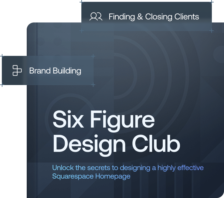
Want a framework for designing the perfect homepage?

Need an expert to build your Squarespace website?
Book a free kick-off call with our team to discuss your project requirements in detail.
2. White Space: The Secret Behind “Clean” Design
White space (or negative space) is one of the most misunderstood tools in web design.
Many people see it as: “Empty space we should fill.”
In reality, it’s the opposite.
Why White Space Matters
White space:
Gives content room to breathe
Improves readability
Draws attention to what matters
Creates a sense of confidence and clarity
In fact, websites that feel expensive almost always have more white space than expected.
The Psychology Behind It
When a site uses restraint instead of filling every inch, it communicates:
Confidence
Clarity
Intentional design
It says: “We don’t need to overwhelm you, we know what matters.”
3. Taste = Knowing What to Leave Out
With AI tools making it easier than ever to build websites, many designs are starting to look the same.
Same layouts.
Same gradients.
Same structure.
So what actually sets great websites apart now? Taste.
What Is “Taste” in Web Design?
The simplest definition: Taste is intentional restraint.
It’s not about what you add, it’s about what you choose to leave out.
Why Restraint Feels Premium
High-end websites don’t try to impress with more, they impress with less.
Fewer elements
Simpler layouts
Clearer messaging
This creates:
Focus
Authority
A sense of quality
The Biggest Mistake Most Websites Make
Adding more to feel “interesting”
Overloading with features, icons, and animations
Burying the core message
The result?
A cluttered, confusing experience that drives users away.
The Hidden Factor: Micro Details Matter More Than You Think
At this point, it might sound like the key is simply doing less.
That’s partly true, but there’s an important distinction:
Restraint vs. Micro Details
Restraint = what you include
Micro details = how well you execute it
Even a minimal site will feel cheap if the details are sloppy.
What Micro Details Include
Consistent spacing
Smooth hover effects
High-quality icons (not generic clip art)
Precise alignment
Subtle animations
Users may not consciously notice these things…
But subconsciously? They notice everything.
Why Micro Details Matter
People judge quality based on care.
A polished site sends signals like:
“This business pays attention”
“This is trustworthy”
“This is premium”
But when details are off, even slightly, it creates doubt.
The Trend Trap: Why Many Websites Feel Generic
There’s another growing issue:
Design trends are being overused.
AI-generated sites often rely on:
Recycled layouts
Popular gradients
Predictable animations
The result? A site that feels:
Generic
Cheap
Forgettable
How to Avoid This
Instead of following trends blindly:
Focus on clarity over decoration
Prioritise structure over style
Design with intention, not imitation
Final Thoughts: What Actually Makes a Website Feel “Premium”
It all comes down to three principles:
1. Strong Visual Hierarchy
Guide users effortlessly through your content
2. Strategic White Space
Let your design breathe and build confidence
3. Intentional Restraint
Focus on what matters, and remove the rest
And don’t forget, the small details are what bring it all together, because in modern web design, success isn’t about doing more, it’s about doing less, better.